Case Study
The Sheridan
Design System

Case Study
The Sheridan Design System
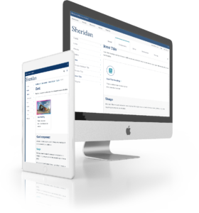
Building a unified design system for Sheridan College to standardize UI, speed up delivery, and enable consistent, on-brand digital experiences
Background
A brand in need of a design system
When I joined, Sheridan had no design source of truth, No Figma files existed, and mockup were being done directly in Sitecore, behind a VPN, limited to what had already been built. There was no prototyping capability, no design-to-dev handoff beyond a PDF style guide, and the CSS had accumulated yours of band-aid fixes.
My role
I had already started consolidating existing web components into a Figma component library, with the intention of speeding up prototyping and reviews, when Sheridan’s first in-house brand refresh arrived. The complexity of the new brand made and even stronger case for centralizing design decisions – work I was already in the process of doing.
The ‘Unlock’ brand refresh
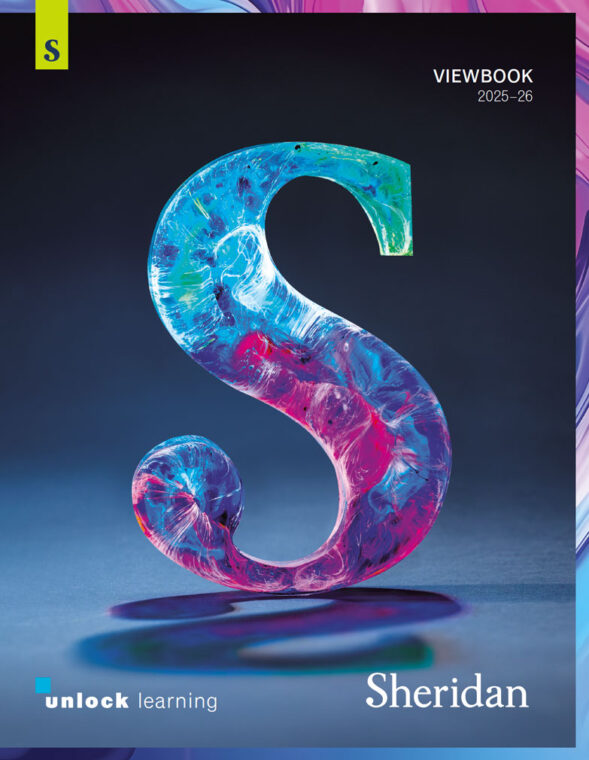

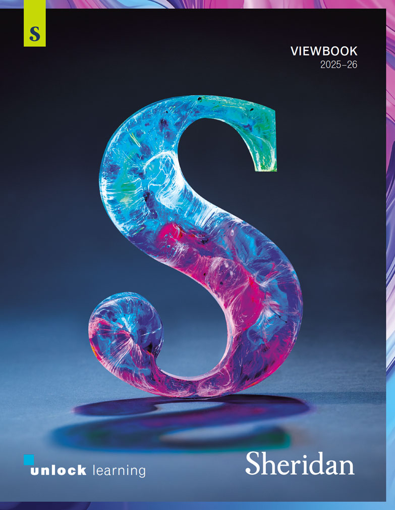
Sheridan’s 2024-2025 Viewbook cover
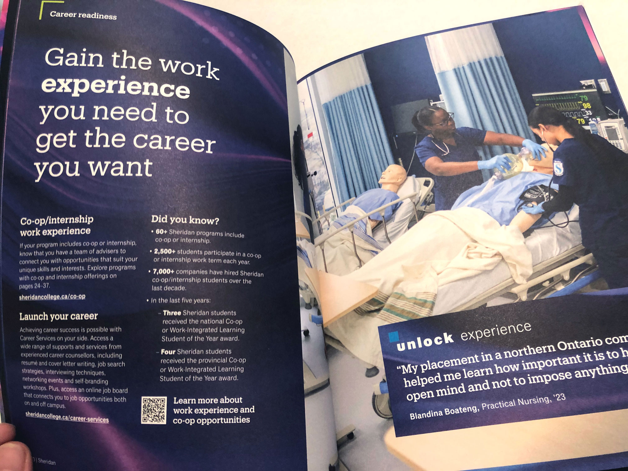
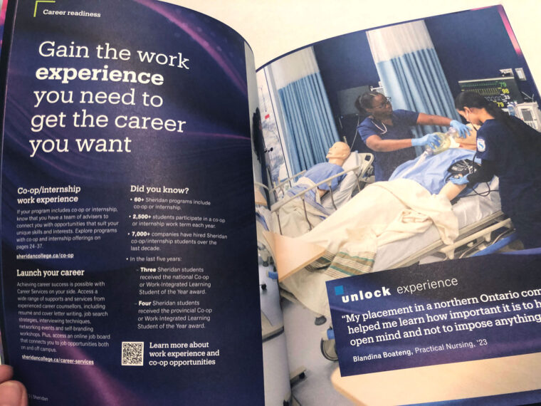
Inside Sheridan’s 2024-2025 Viewbook

A mocked up billboard ad for Sheridan using the new Unlock branding
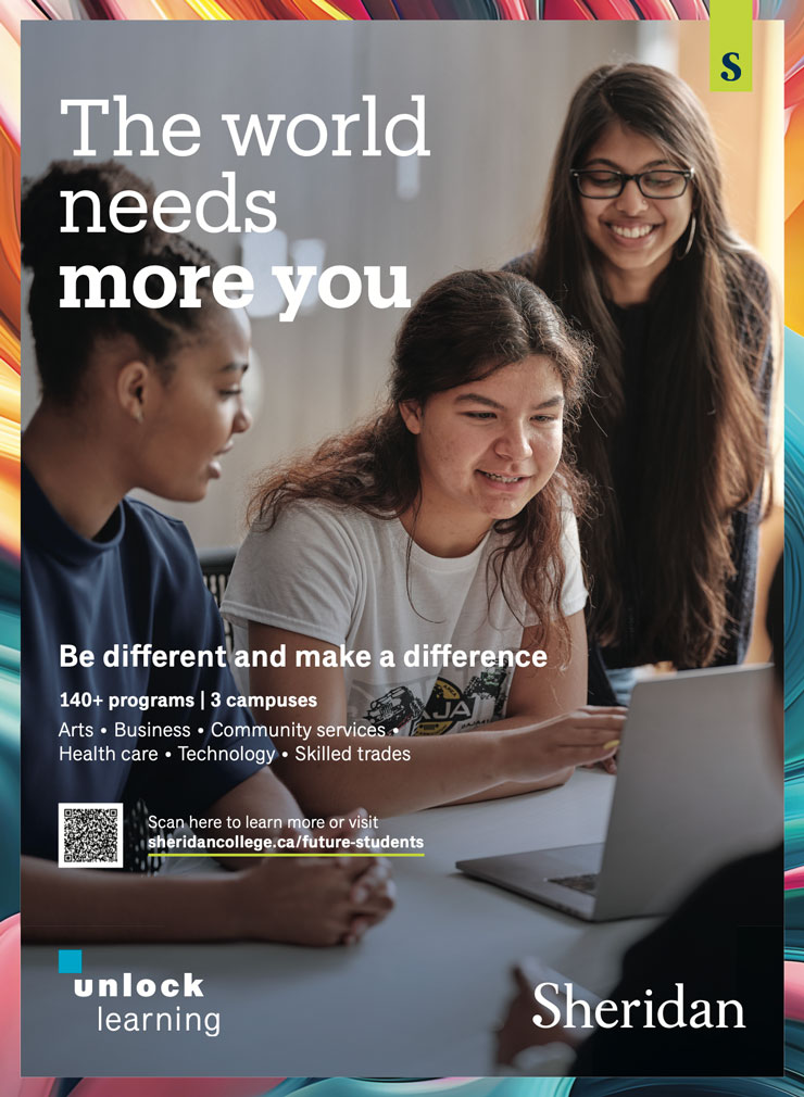
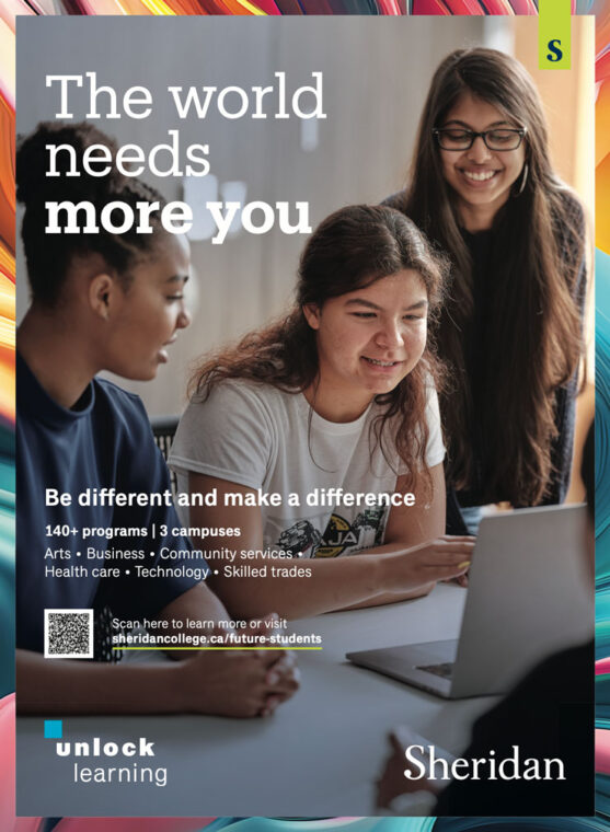
A poster ad for Sheridan using the new Unlock branding
Translating the new brand to digital
My task was to translate the new brand to the website. The brand leaned heavily on abstract imagery – as content frames and text backgrounds – and this introduced two real constraints: the treatments had to be feasible in HTML and CSS, and accessible in a scenario WCAG 2.2 doesn’t cover.
The result was the beginning of the Sheridan Design System (SDS)
Process highlights & challenges
UI challenge: The S-Frame
Abstract image frames were the primary visual feature of the new brand – but CSS border properties were not sufficient to achieve the desired visual effect.
The image library library was organized into faculty-specific, and department-specific sets – including accessible variants of some images. Applying the accessible version required only adding a single modifier class, keeping the implementation simple for developers
Detailed documentation for this component can be found in the browser-based SDS Manual demo.
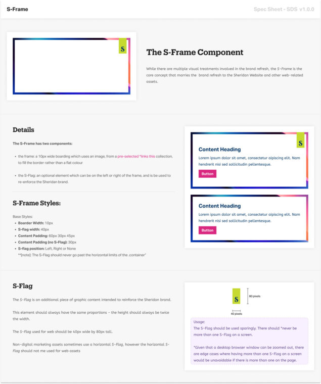
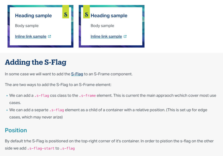
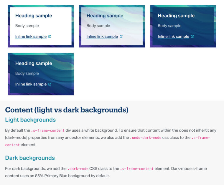
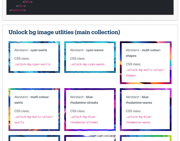

The primary S-Frame spec sheet from the SDS Figma library
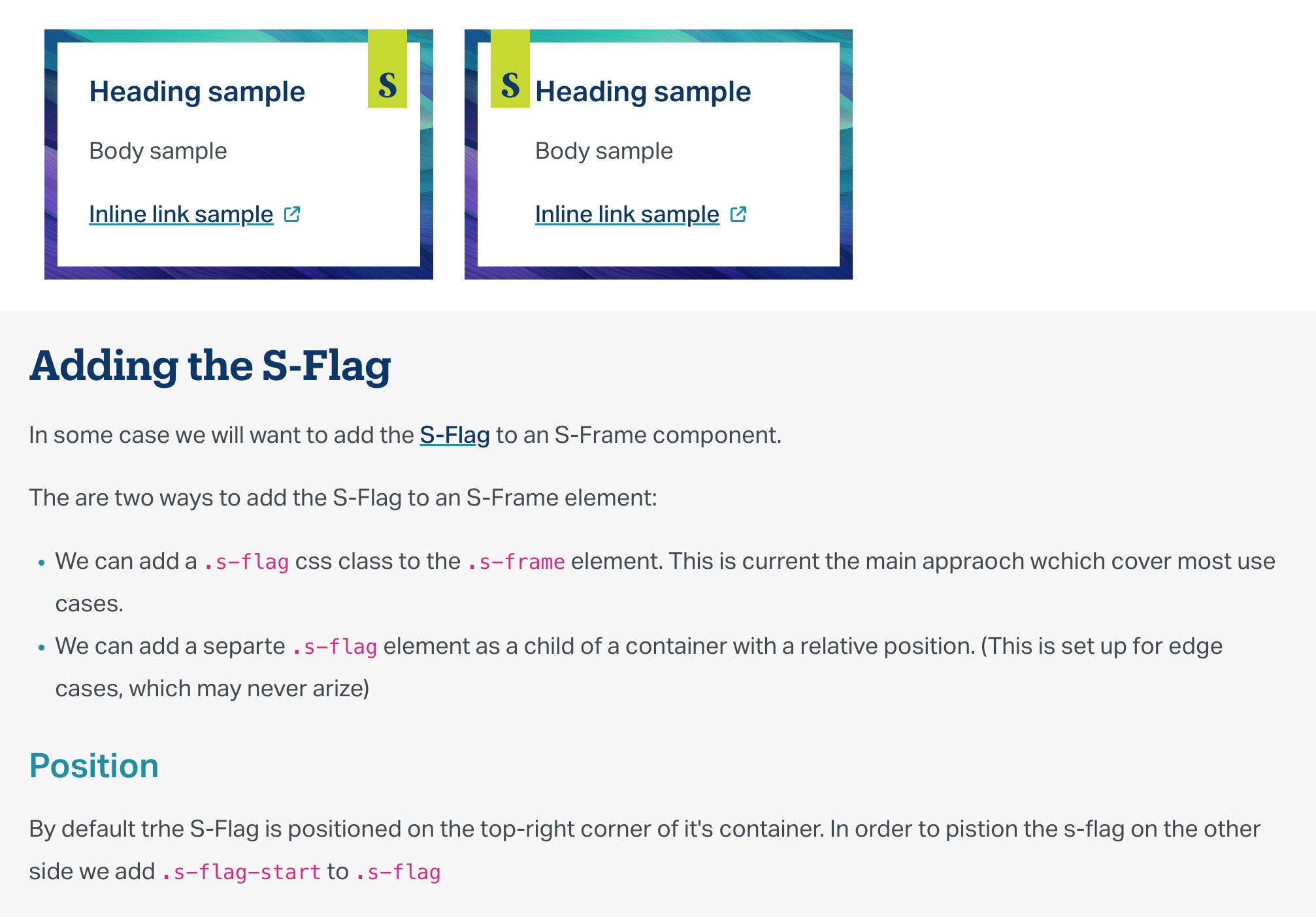
S-Flag positioning rules
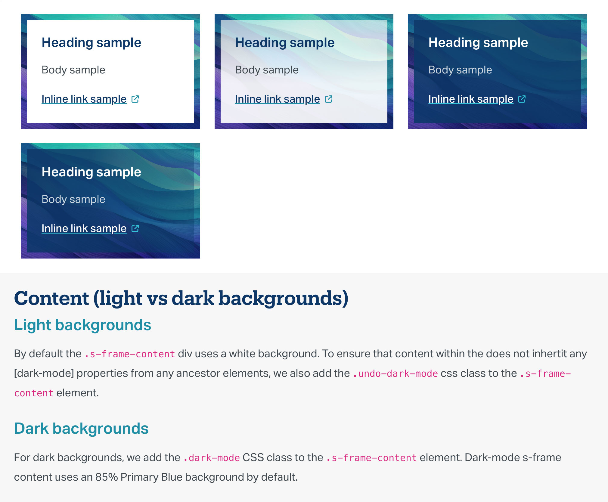
S-Frame content documentation
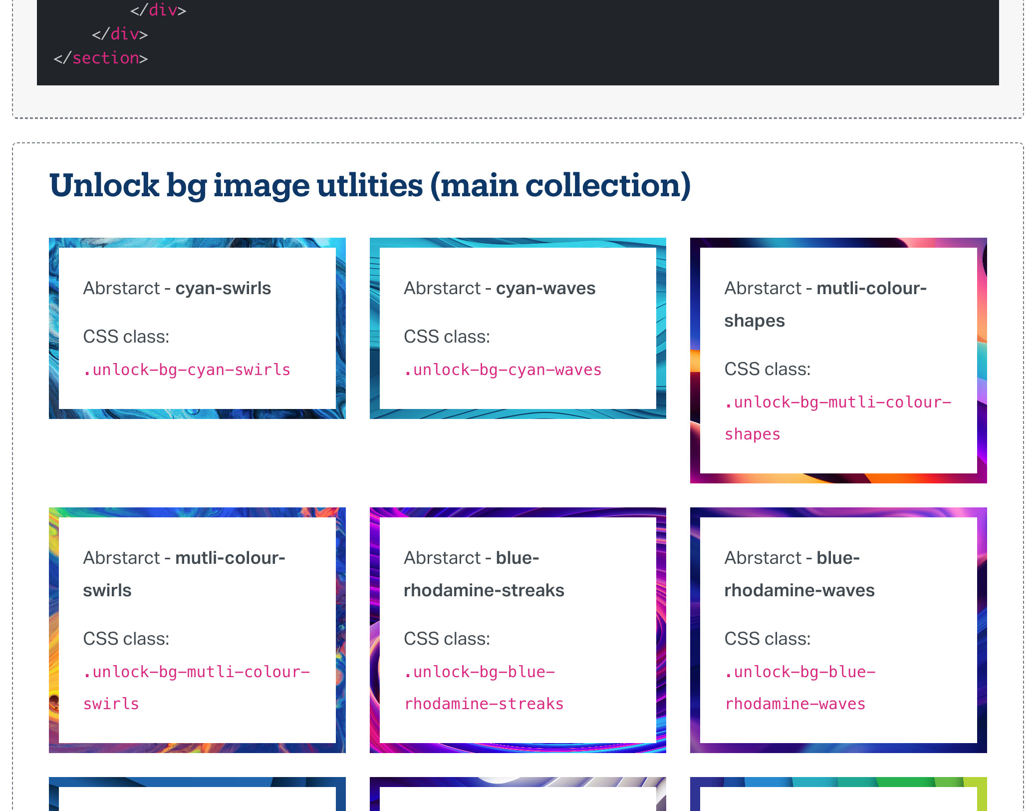
S-Frame variant documentation
Accessibility: color and imagery
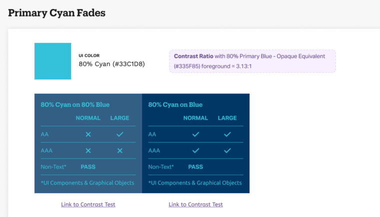
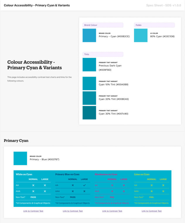
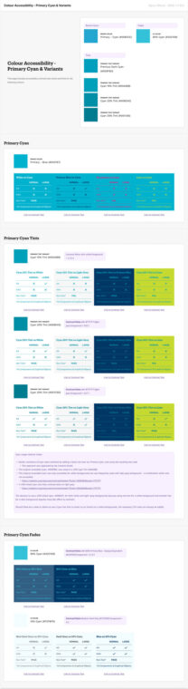
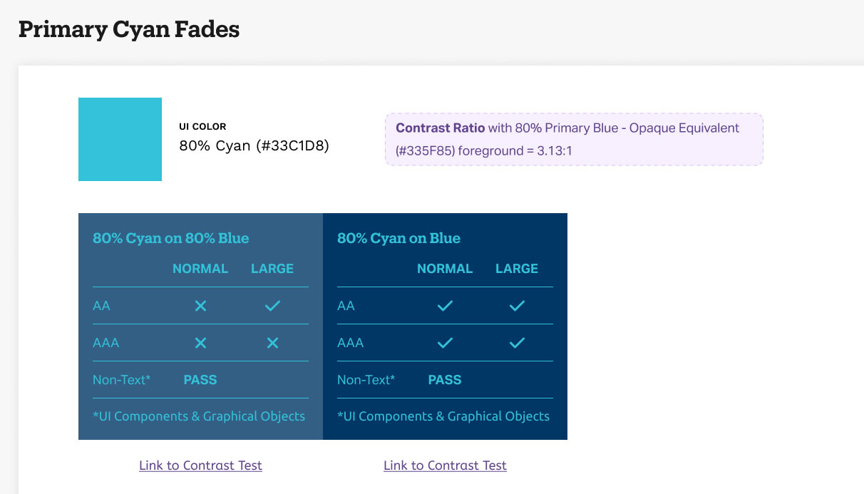
Contrast Ratio documentation for the Cyan alternative intended for text on dark backgrounds
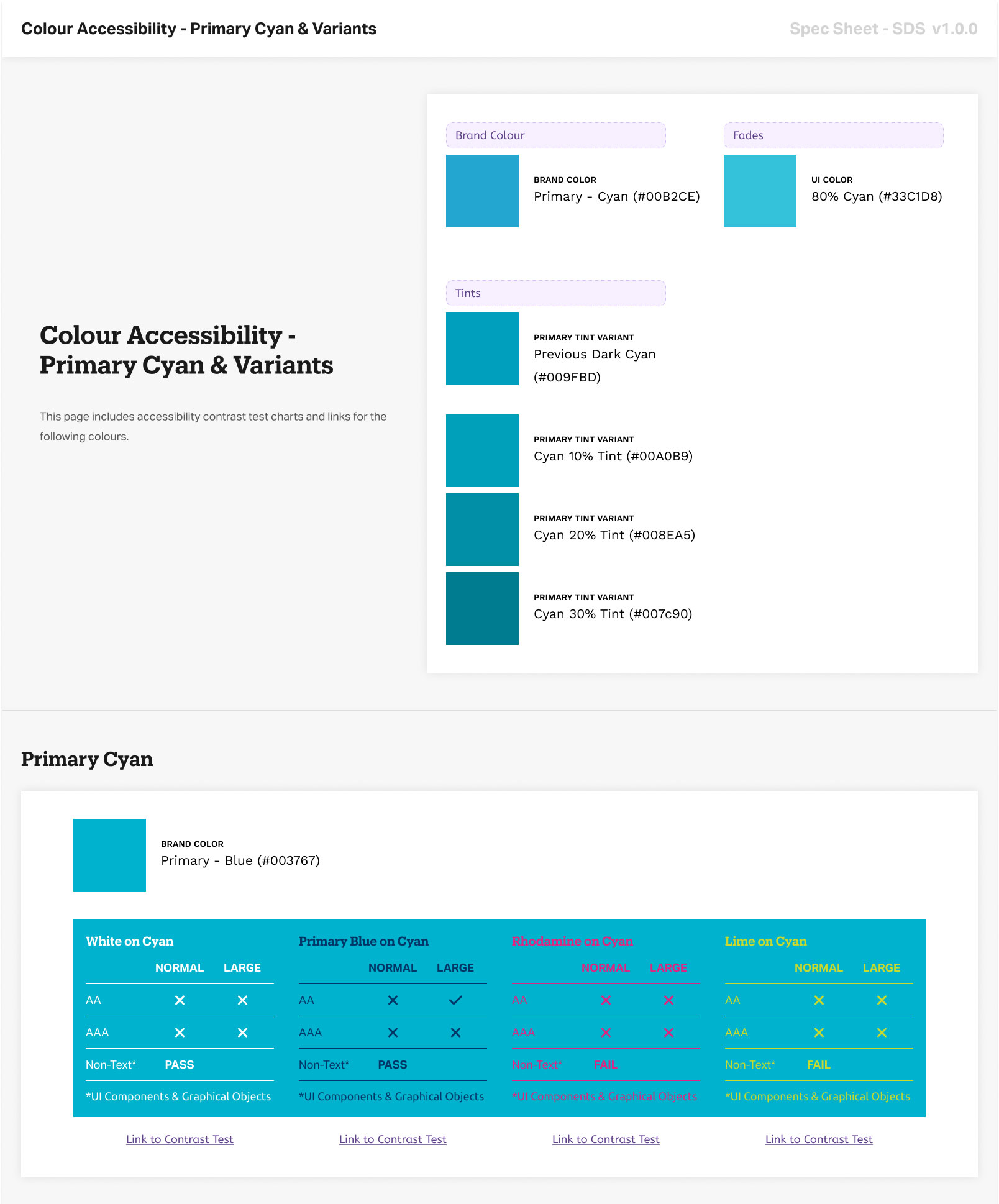
Cyan spec sheet. Introduces the original Primary Cyan colour, along with its accessible alternatives
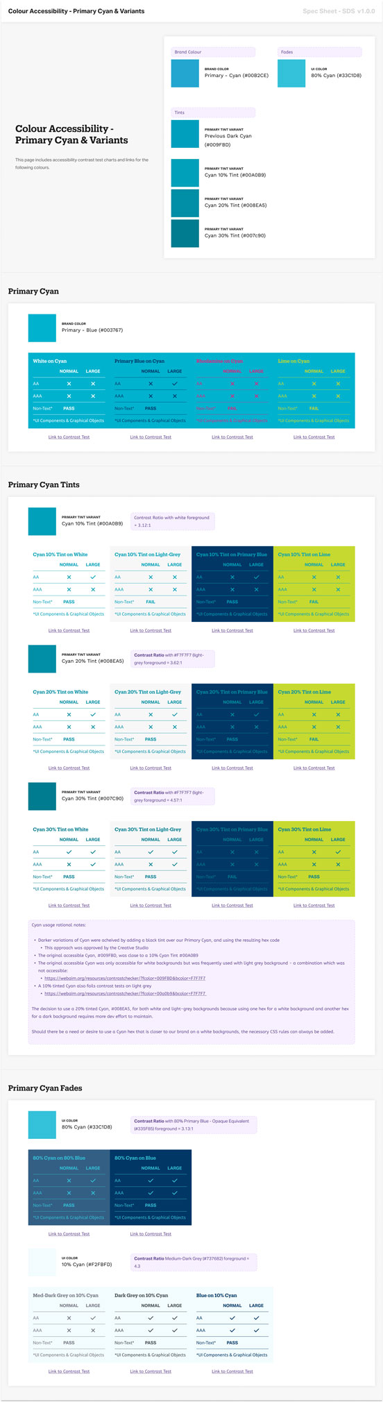
Contrast Ratio documentation for the Cyan alternative for text intended for use on light backgrounds
Resolving inaccessible brand colours
Sheridan’s Cyan was one of two primary brand colours – and it failed WCAG contrast requirements. This was not something we could ignore.
I worked with the creative team to introduce two compliant Cyan variants, one for light backgrounds and one for dark, and documented them in the SDS so they could be applied consistently across projects.
Accessible text on abstract backgrounds
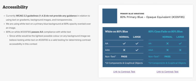
WCAG 2.2 (1.4.3) offers no guidance for text on background images or gradients – so there was no established standard to follow.
I developed a two-path system. For a curated subset of images, I tested contrast at the lightest pixels and modified each image in Photoshop until it met AA requirements against Sheridan’s white and Light Cyan text colours. For all other images an 80% Sheridan Blue overlay was applied – which both ensured accessibility where text appeared and reinforced the S-Frame visual language.
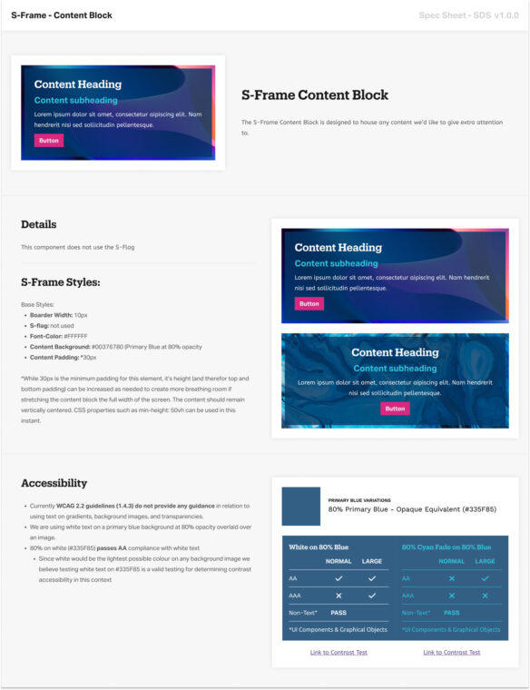
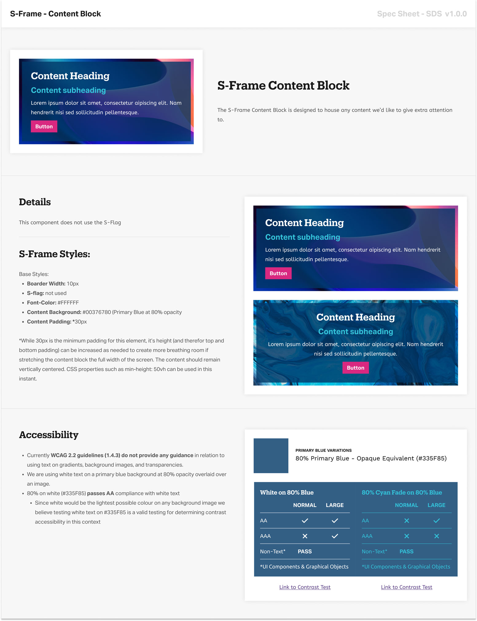
The S-Frame Content Block spec sheet, including accessible colour contrast notes below
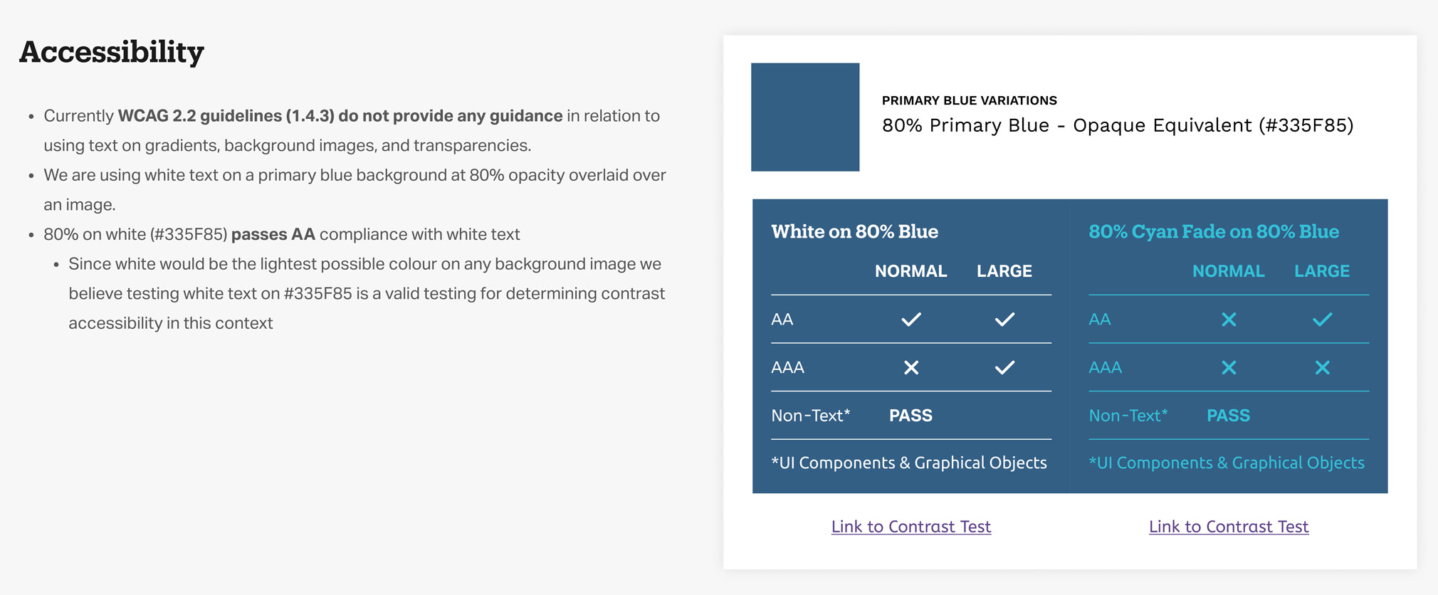
A closer look at the documentation explaining the overlay approach to solve for using text in combination with the abstract images used in the Unlock branding.
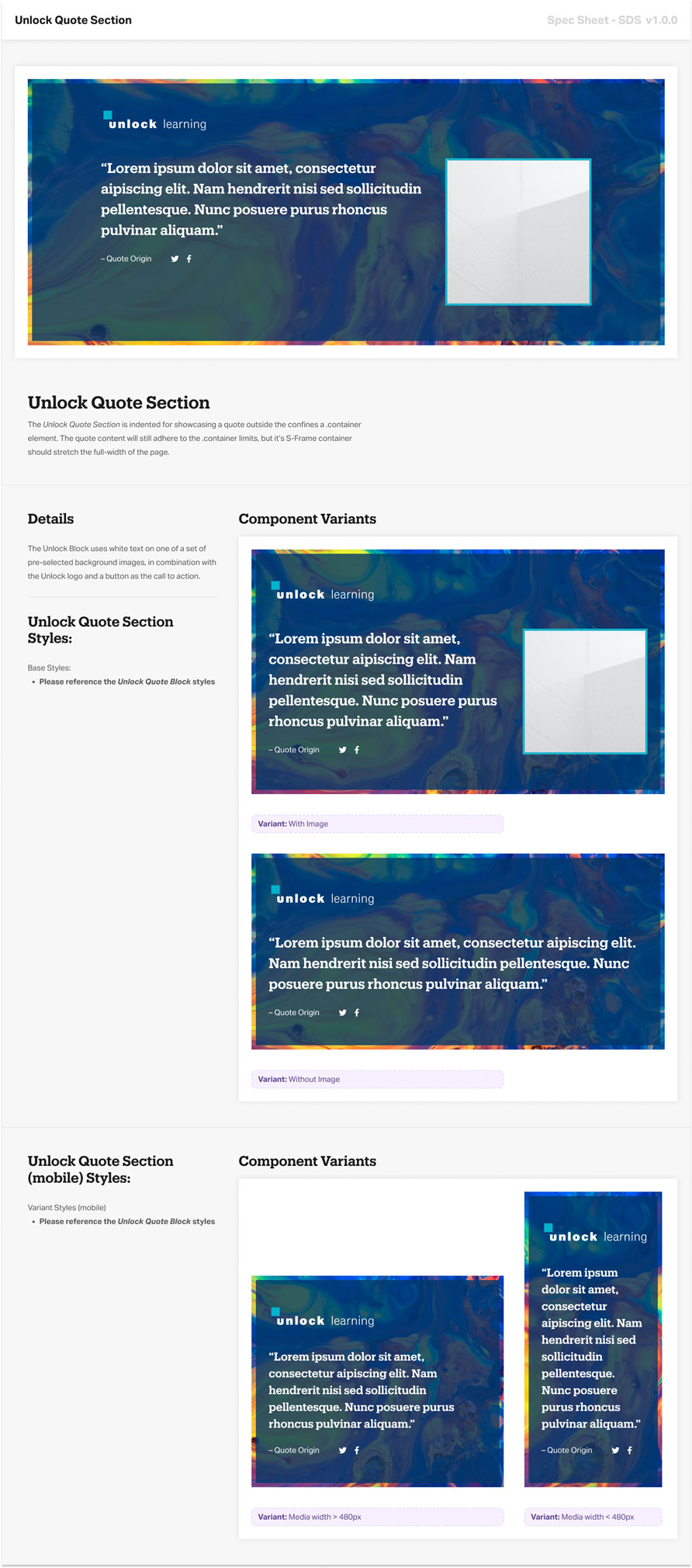
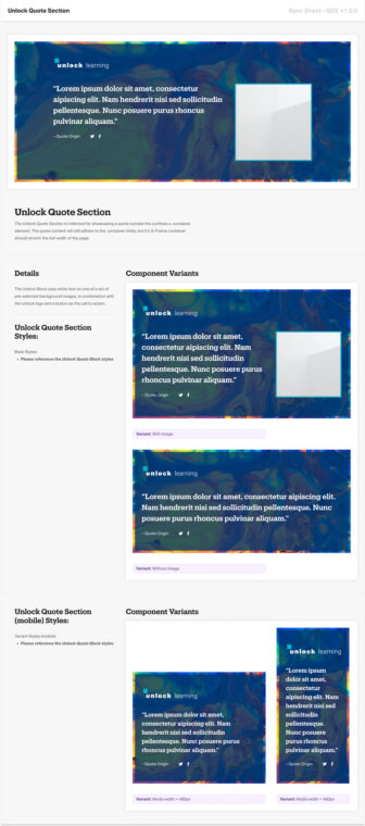
The Unlock Quote Section spec sheet
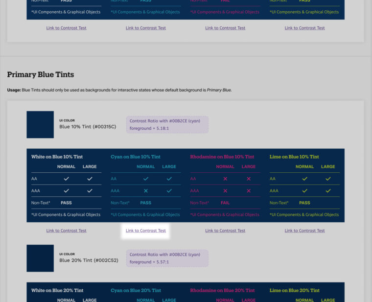
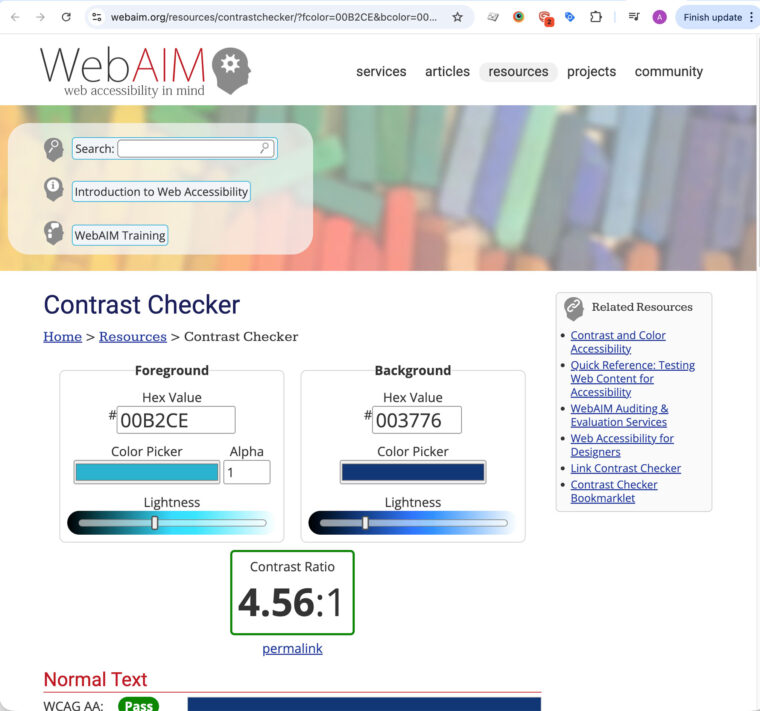
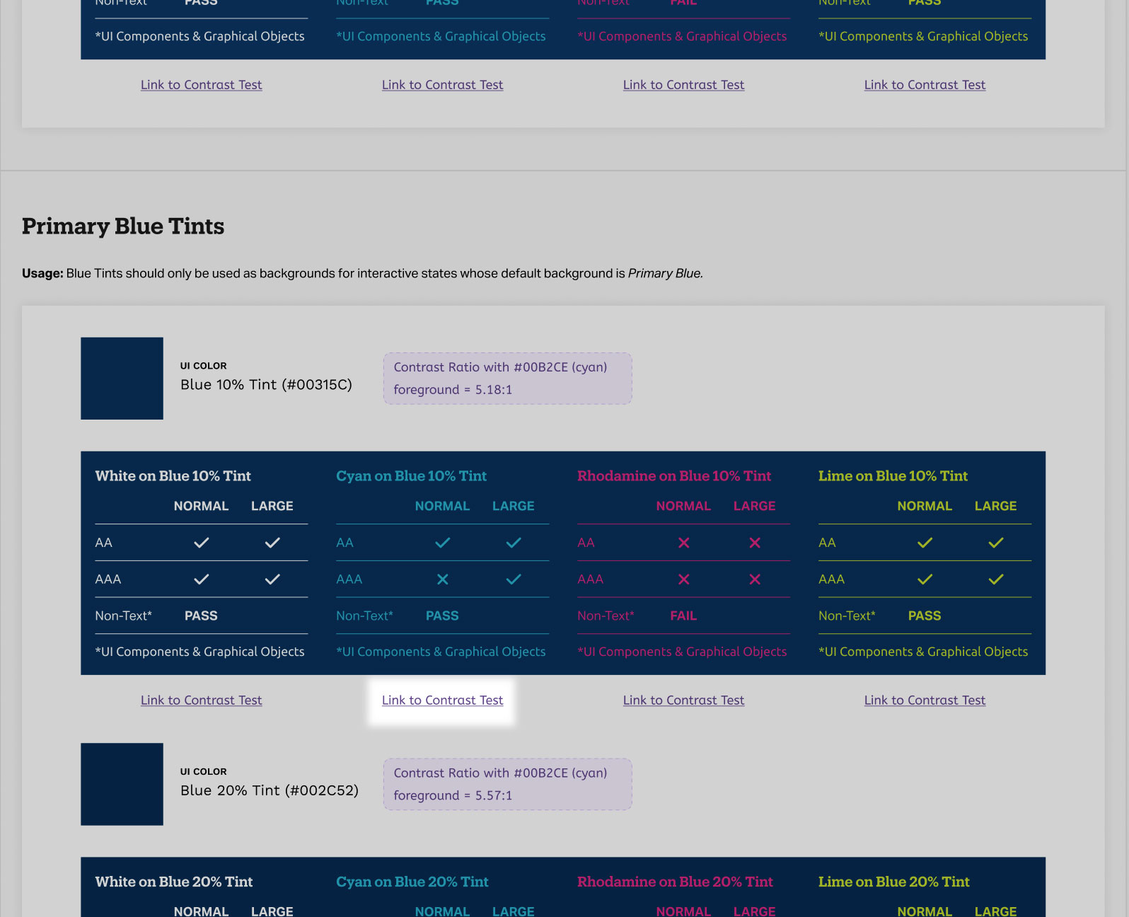
All SDS colour contrast documentations linked out to relevant contrast test pages as an additional reference and resource
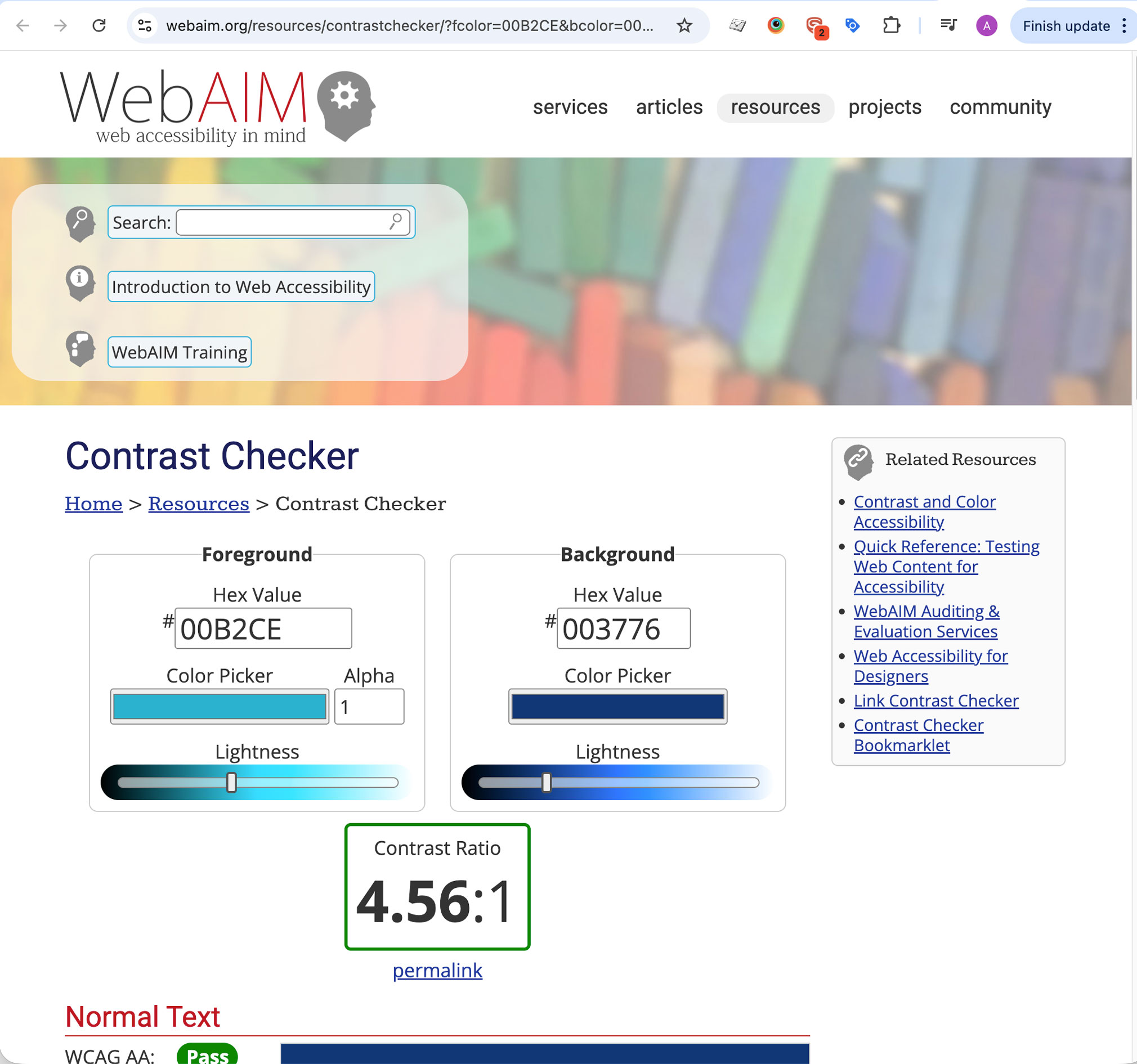
A sample page from the online contrast checker that I linked to in the SDS documentation.
Documenting accessible colour treatment
All accessible colour standards were documented in the SDS – dedicated specsheets for every brand colour, with contrast ratios and links to live contrast tests, replacing the limited coverage in the original web style guide.
UX improvements alongside the refresh
Mobile breadcrumbs
Major global UI changes in Sitecore required vendor involvement and were costly to ship. Breadcrumbs were high-impact, low-effect improvement I could design, build, and push to UAT myself – a quick win that didn’t require navigating the full vendor pipeline.
On mobile, breadcrumbs simple wrapped as the screen narrowed – a real usability problem for users who had drilled several layers into the IA. I applied a standard responsive truncation pattern, then built and pushed the updated component to UAT.
Research I later conducted with first-year students confirmed mobile as a primary device for on-campus and post-acceptance usage – validating that optimizing for mobile for the right priority.
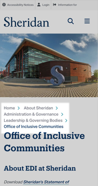
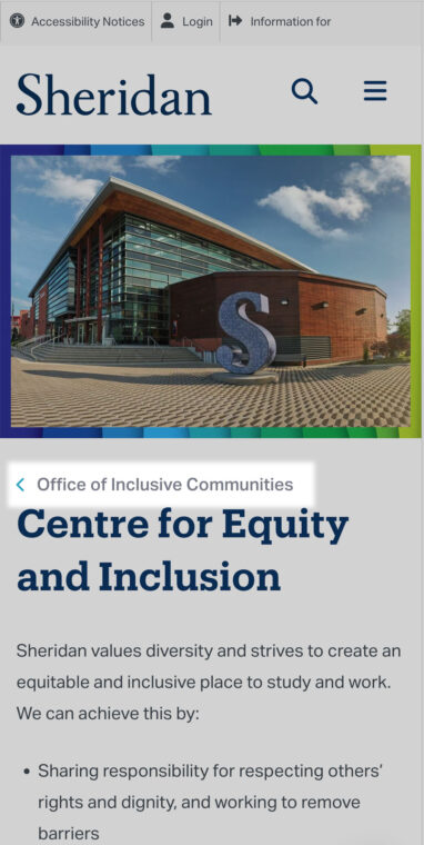
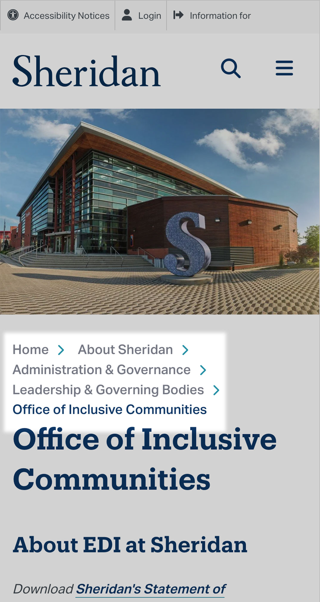
Old mobile breadcrumbs
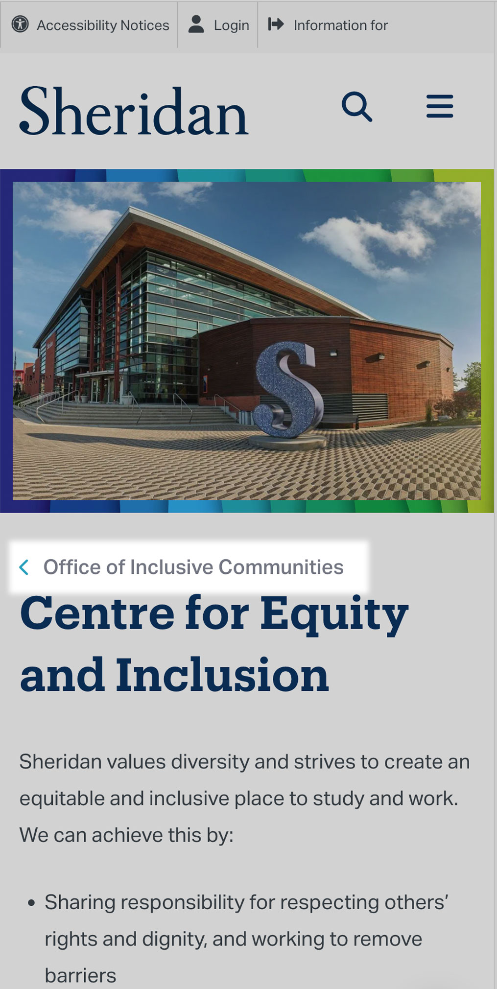
New Refined mobile breadcrumbs
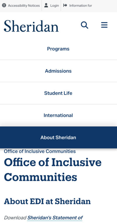

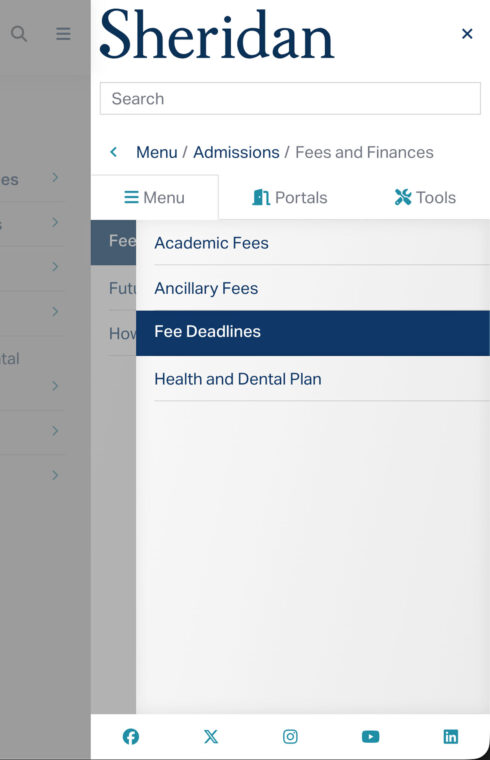
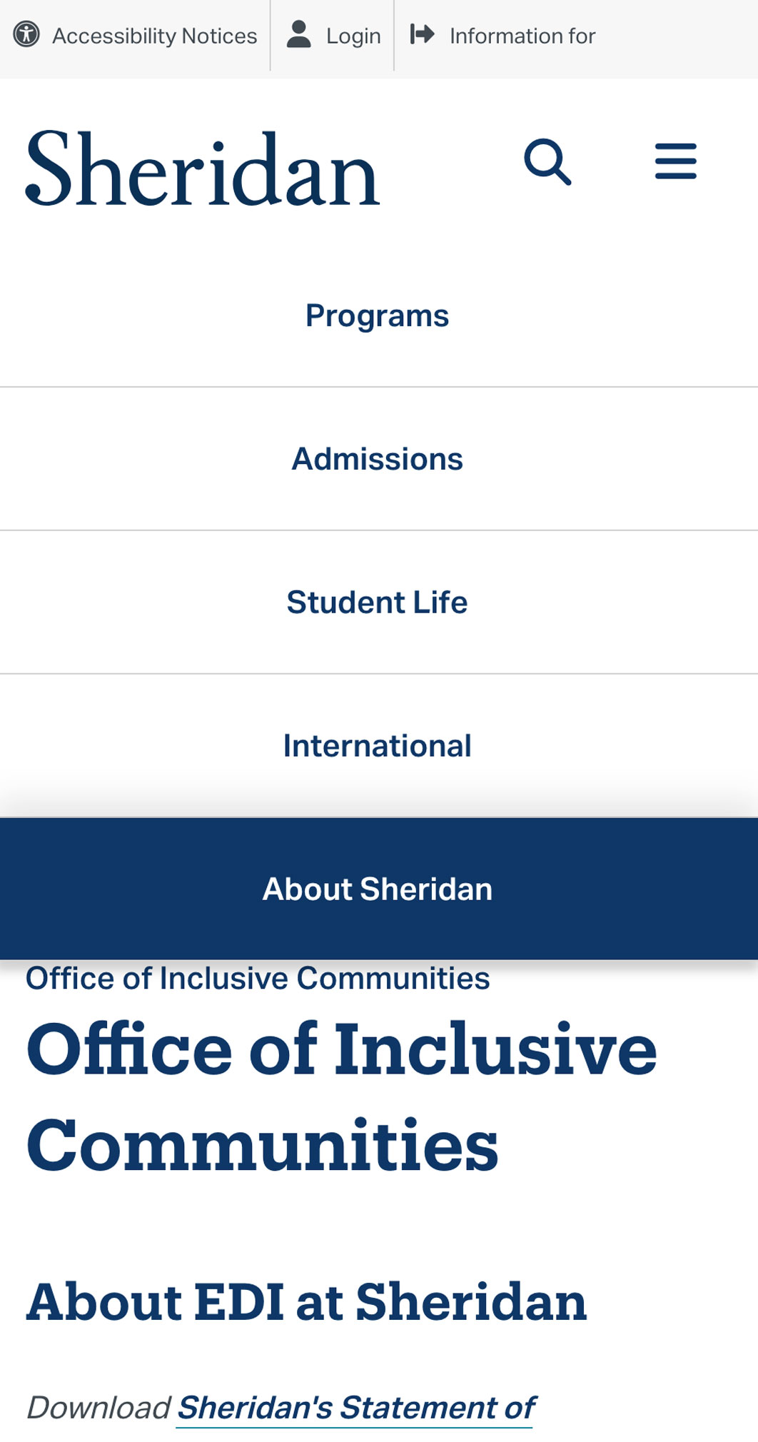
A single-tier mobile menu is all user have in Sheridan’s current Sitecore implemention of the their primary website.
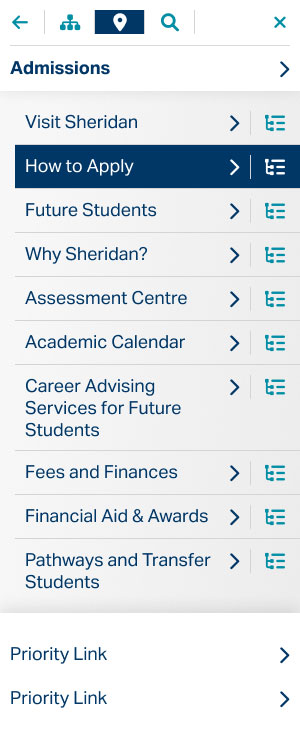
Initial design exploration for a more robust mobile menu. This was prior to my discovery of MMenuJS which was eventually integrated into a future front-end framework
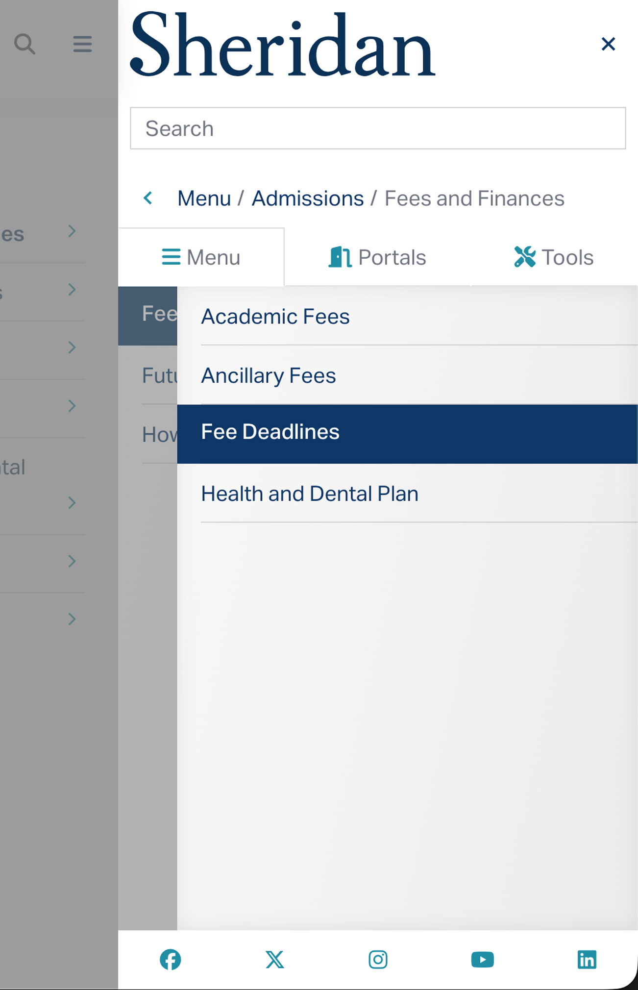
The MMenuJS integration, allowed us to support infinite tiers of submenus within the constraints of mobile devices.
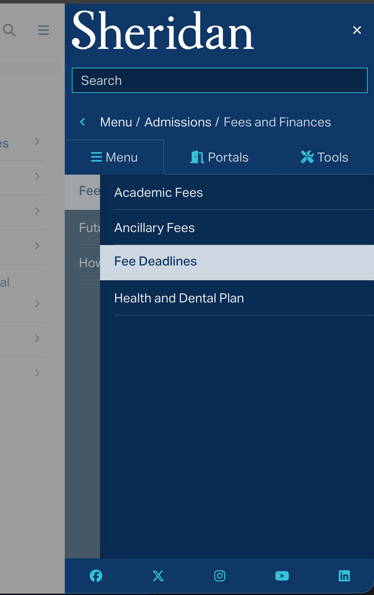
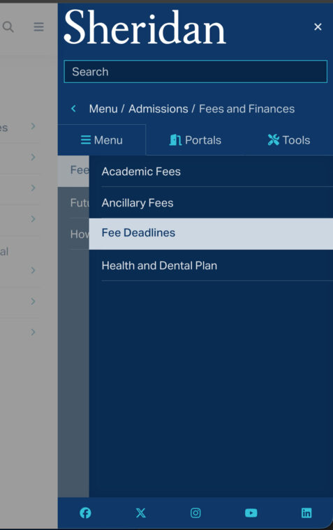
A dark-mode variations of the new MMenuJS integration.
A better mobile menu (proposed)
Sheridan’s mobile menu offered a single tier and was only accessible from the top of the page – a significant navigation problem given the depth of the site’s IA.
Early conversations with vendors and the web manager made it clear that even a sticky header would be difficult to implement in Sitecore. I had a local deployment of the build and could see why – but the problem would need to be solved eventually, so I began exploring nested navigation patterns in Figma regardless.
While researching solutions I discovered MMeneJS, which was around the same time the Drupal migration was announced. I incorporated the new mobile menu into the browser-based SDS documentation and later implemented it in the ServiceNow portal, where it could actually ship.
The design system’s impact
Before the SDS, there was no way to prototype or review designs without building directly in Sitecore, which was all behind aa VPN. After, same-day page mockups became routine. This changed how quickly the team could respond to stakeholder requests and iterate on the design.
The track record earned enough organizational trust that when another department needed their ServiceNow portals aligned to the new brand, I took on the work internally rather than bringing in a vendor. The SDS scaled to a second platform without rebuilding from scratch.
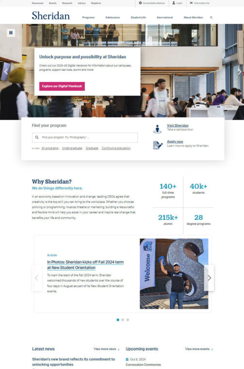
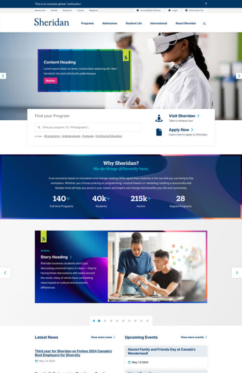
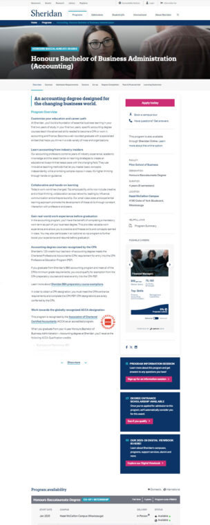
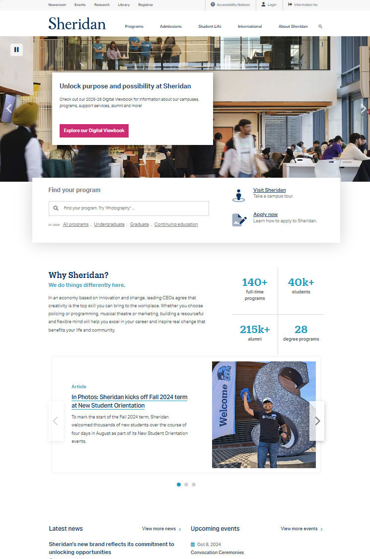
Sheridan’s home page 2023

Sheridan’s home page 2025
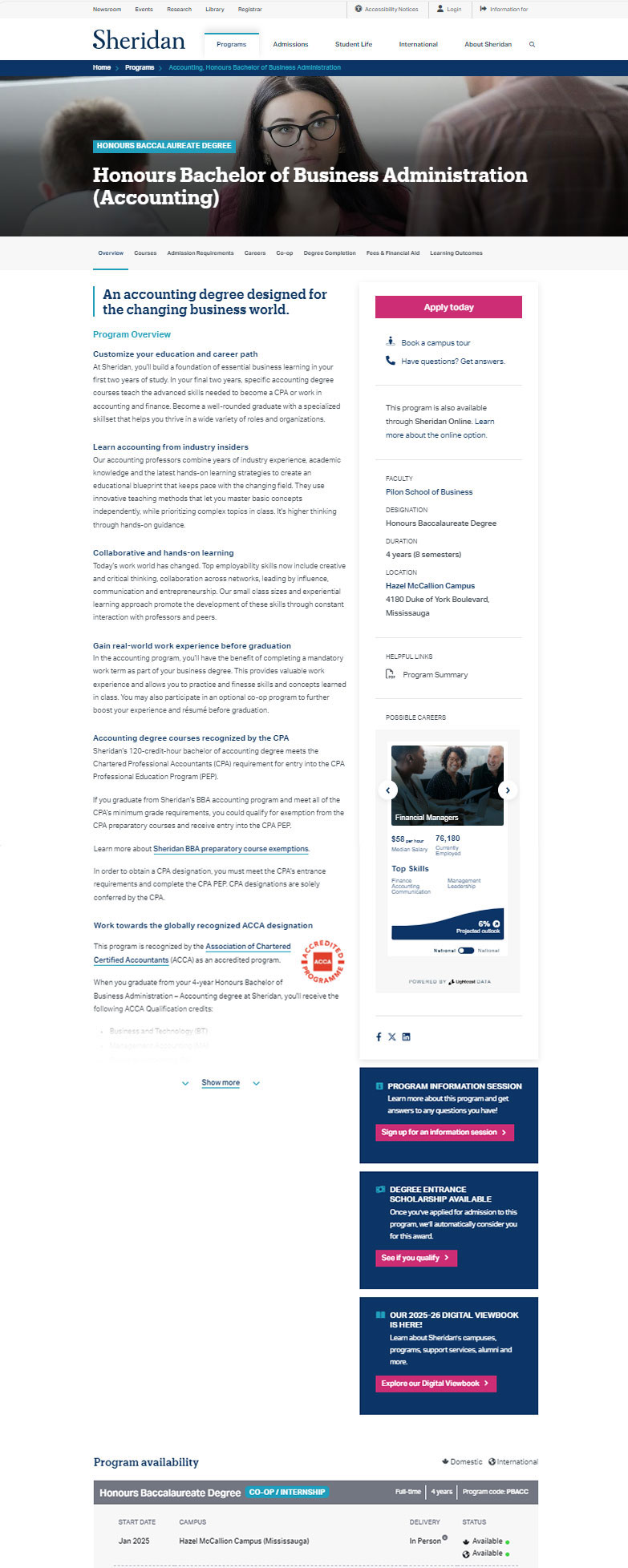
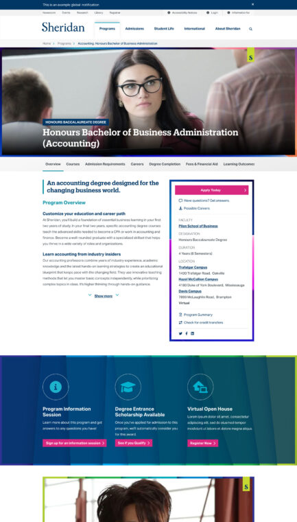
Sheridan’s program page 2023
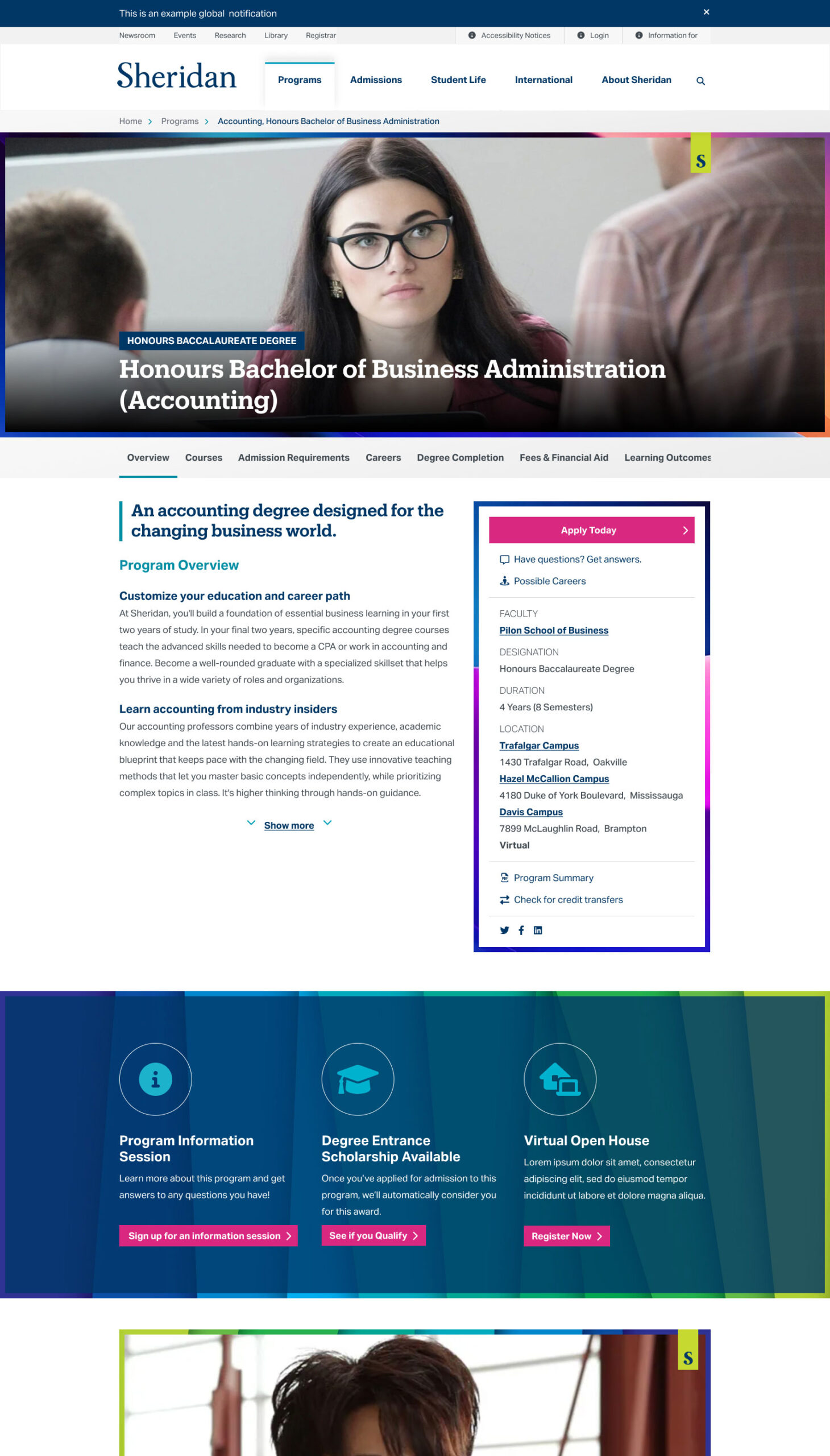
Sheridan’s program page 2025
Insights & takeaways
Identify system value in business terms early.
The SDS centralized design decisions, compressed cycles, and gave the team the ability to move without vendor dependency. When I started seeing early signs of vendor misalignment, I tried to surface the risk – but I didn’t yet have the business language to make that case land with leadership.
The lesson: frame system value in business outcomes from the start, before it needs defending.