Case Study
OutdoorSmart

Case Study
OutdoorSmart
Designing a LMS/CRM platform which offered region-specific, outdoor activity licensing courses, across multiple sub-brands.
Background
What is OutdoorSmart?
OutdoorSmart is provincial outdoor activity safety educator and license issuer in Canada, operating across multiple sub-brands – such as BoatSmart and HuntingSmart – each tied to a different outdoor activity.
The challenge
The platform served two distinct audiences: admins managing region-specific course content, customer lifecycles, and staff collaboration across sub-brands; and end users completing licensing courses. The design challenge was building a system robust enough for complex admin workflow whiles keeping the learning experience focused and engaging for end users.
Highlights

OutdoorSmart (new) – An Ambitious Dashboard Component
The “Customer Lifecycle” dashboard component
An Ambitious Dashboard Component
The client needed a way to track customer engagement across sub-brands and regions throughout the customer lifecycle, and generate targeted communications based on where users were in the journey. The problem was clear; the solution required significant conceptual work.
The result was a dashboard component that visualized the entire user population across lifecycle phases, with customizable segments that admins could use to generate mass communications – filtered by phase, region, and user tier.
Segmented Lifecycle Representation
Each lifecycle phase displayed its user segments as circles scaled by either dollar value or total users – a deliberate choice to make population-level data faster to scan than a table of numbers.
Segments, which we called Buckets, could be toggled and edited to support different admin workflows.

OutdoorSmart (new) – Segmented Life Cycle Representation
Users were segmented into customizable “Buckets”


OutdoorSmart (new) – Robust viewing interface

Linear lifecycle navigator and phase display selector

The lifecycle component in the dashboard was limited to two phases, due to the available room on the page. In the Customers section, the admin could view up to 3 phases and 3 value groups at one time.

Second viewing dimension segmented the users into value tiers
Robust viewing interface
Admins could focus on one, two, or three lifecycle phases at a time – enough to work with details without losing the broader picture.
To maintain context, the linear navigation component adapted to the number of phases in view, always reflecting where the admin was in the full lyfecycle.
A second dimension allowed further segmentation by value tier.
Nested Lifecycle Phases
The component also supported a supported a two-tier phase structure. Admins could drill down from a high-level phase – such as Registered or Engaged in Course – into second-tier phases like Lesson 1 or Practice Exam.
Breadcrumb navigation reflected the current position within the phase hierarchy and allowed admins to zoom back out to the top-level view – keeping context intact at every level of detial.


OutdoorSmart (new) – Nested Life Cycle Phases

A breadcrumb style navigation reflected context within the phase tiers and allowed the admin to zoom back out to the first-tier view.

By Clicking the zoom icon, admin could drill down from a view high-level phase


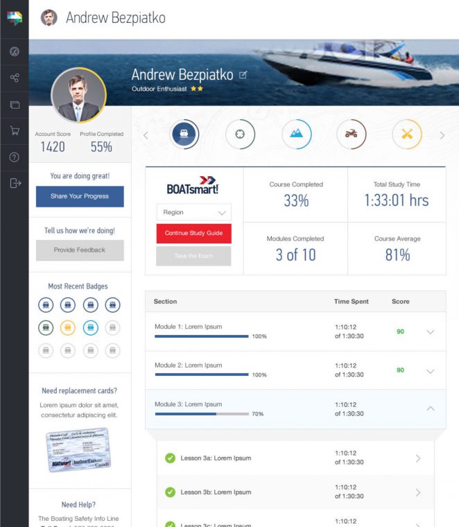
OutdoorSmart (new) – Gamifying the End-User Dashboard
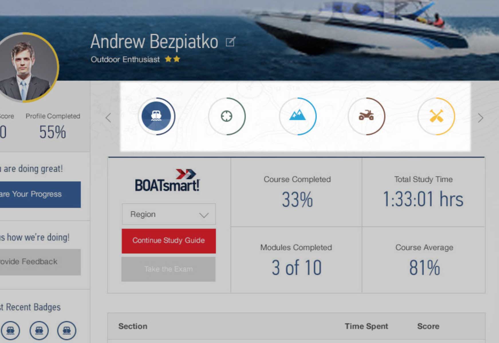
Circular progress bars were used to echo the badging system and create a more visually appealing infographic

Engagement badges

Progress sharing call to action was a top priority in the enduser dashboard layout

The end-user dashboard for desktop
Gamifying the End-User Dashboard
Badges were an established gamification pattern for incentivizing platform engagement. Circular progress bars were introduced to visually echo the badge system – creating a cohesive infographic language rather than a disconnected set of UI elements.
Progress sharing was given high visual priority in the dashboard to drive bran awareness and encourage users to bring others into the platform.
Region-Specific Course Material
Regional content variations were managed through a single dropdown at the top of the page. Selecting a region surfaced the full standard course content, with the option to modify existing material or add region-specific content on top.
Content unique to a region was flagged with a star – making it immediately clear what was standard and what had been customized, with requiring a separate view for each region.
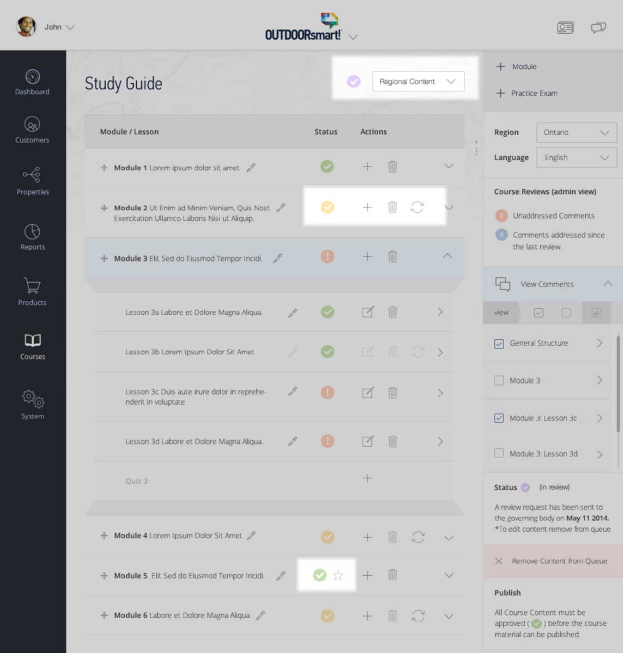
OutdoorSmart (new) – Region-Specific Course Material


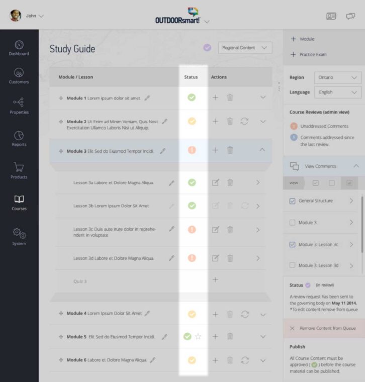
OutdoorSmart – Collaboration and regulatory compliance

Sidebar commenting component.

comments dialogue ui (early prototype)

Status icons
Collaboration and regulatory compliance
Course content required review by regional regulatory bodies before it could be published – making structured review workflow a compliance requirement, bot just a convenience.
A commenting component in the course editor sidebar, along side status markers, allowed content to move through the necessary review phases with fill visibility for both staff and regulatory reviewers.
The Learning Environment
Keeping users focused during the lesson was a deliberate priority. The main dashboard navigation was hidden entirely while a user was engaged in course content – accessible via an icon when needed, but out of the way by default. In a licensing course context, where completion rates matter, reducing environmental distraction was a meaningful design decision.
A course overview and navigation sidebar gave users context within the module structure without pulling them out of the lesson flow. The sidebar was hidden by default for tablet and mobile users to preserve screen real estate – but in hindsight, desktop should have had the option too. Giving users control over their won learning environment would have been the more considerate call.

OutdoorSmart (new) – The Learning Environment
Reflections
Progressive disclosure at scale
A system with this many moving parts – multiple sub-brands, regions, user types, and lifecycle phases – could easily overwhelm both admins and end users. The approach taken across the platform was to surface complexity only when need. This meant drilling down into lifecycle phases, filtering by region, and hiding navigation during lessons. Progressive disclosure wasn’t just a pattern, it was an organizing principal that made complexity digestible.
Giving users control
The learning environment taught a specific lesson about user control. Hiding the course sidebar on table and mobile made sense for screen real estate, but not offering desktop users the option to hide it was a decision made on their behalf, and doesn’t consider users that prefer less distraction on screen when learning.
Reflections?
Lorem ipsum dolor sit amet – h3.h2
Lorem ipsum dolor sit amet labore cras venenatis.
Lorem ipsum dolor sit amet – h3.h2
Lorem ipsum dolor sit amet labore cras venenatis.