Case Study
DP&O

Case Study
DP&O
Ensuring accessibility compliance while improving the CMS experience for administrators.
Background
About the Project
The client, DP&O (Design Prosthetics & Orthotics), had an existing Drupal-based website that had been active for several years.
Their primary goal was to improve the existing administrative CMS experience and refine the user experience for patients visiting the site. Ensuring compliance with AA level, WCAG 2.1 guidelines was also a crucial objective.
WordPress was floated as a possible alternative to the existing CMS. Based on the platform’s intuitive page editor, widespread usage and robust development community, the solution of migrating the website to WordPress allowed us to improve the content manager’s administrative CMS experience, while ensuring a robust solution for years to come.
My Role
- Developed a custom, WCAG 2.1 AA compliant WordPress theme based on the existing Drupal build
- Identified, and took advantage of, opportunities to improve both patient-facing, and administrative user experiences
- Leveraged WordPress’s intuitive page-builder feature and improved on UI components from the old Drupal build.
- Migrated website content and deployed new build.
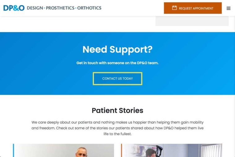
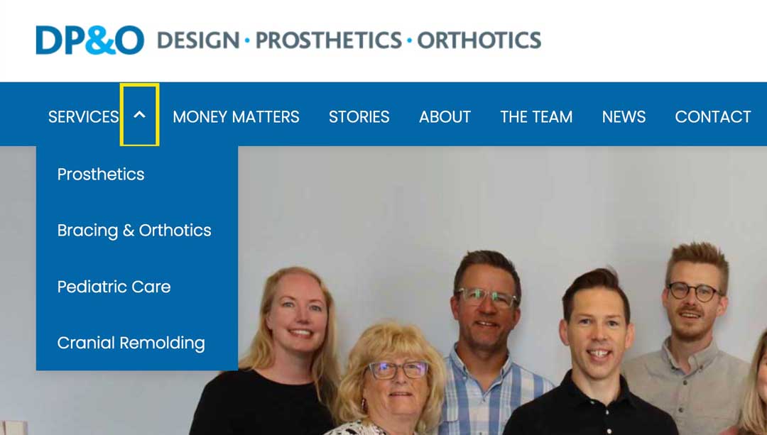
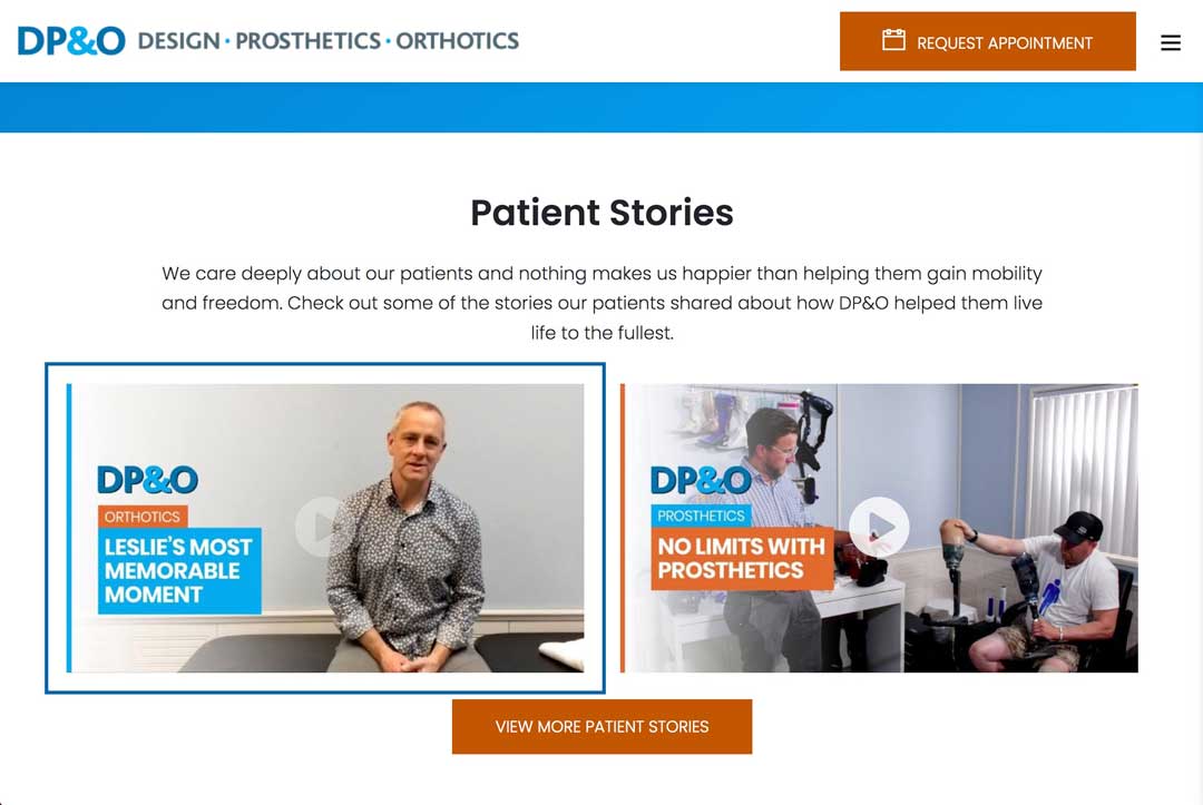
BUILDING FOR ACCESSIBILITY
Leveraging a more intuitive CMS


DP&O – The case for WordPress

A section of the home page as seen in the Drupal content editor

A section of the home page as seen in the WordPress Block Editor
The case for WordPress
In recent years WordPress has introduced and refined a ‘what you see is what you get‘ page builder known as the Block Editor.
In comparison to Drupal’s administrative interface – which is essentially a form that needs to be filled out – this feature embodies the ‘Recognition Rather Than Recall‘ heuristic with the significantly more intuitive user experience it offers.
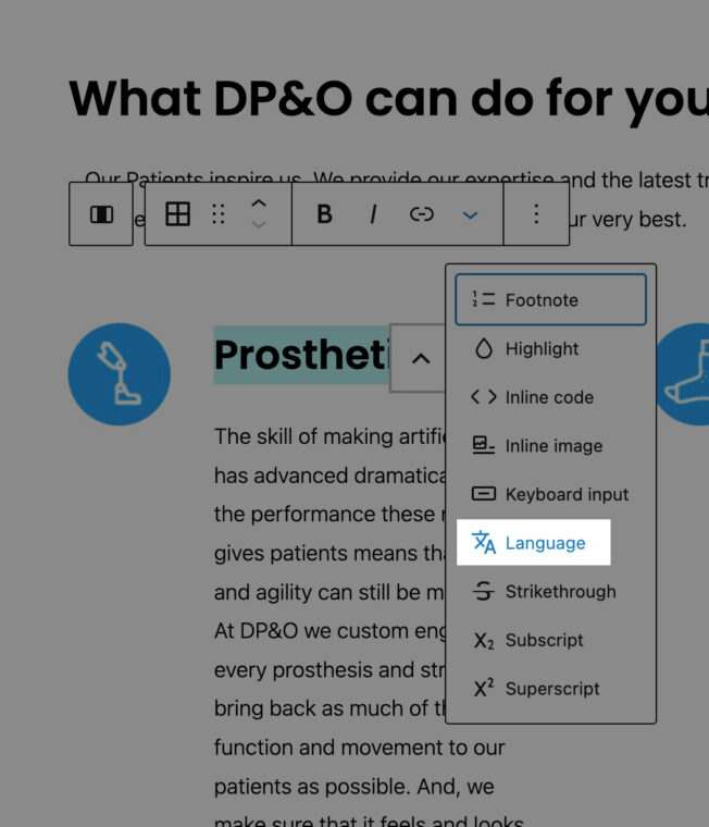
Built-in content accessibility features
WordPress also has made many great strides toward facilitation the creation of accessible content.
The WordPress block editor, for example, allows editor to tag words or phrases within the content, that are in a different language, with the appropriate language codes simply by highlighting the text.
The block editor also has a built-in contrast checker, which is great for testing the contrast between two colours. Unfortunately, when it comes to more advanced layouts – where transparent backgrounds are involved – it’s utility is limited.
Regardless of these limitations, it’s still an important step forward, which shows that the WordPress community is taking accessibility into account with every iteration of the platform.


DP&O – Built-in content accessibility features in WordPress

The WordPress language tag option

The language tag input field. Both ISO 639-1 and ISO 639-3 language code standards are sufficient for flagging languages in web content

The built-in contrast checker from the WordPress block-editor
Ensuring The Web Content is Perceivable


DP&O – Colour Contrast

The old website had contrast errors, when scanned using Chrome’s Lighthouse tool.

The new website had not contrast errors, when scanned using Chrome’s Lighthouse tool.
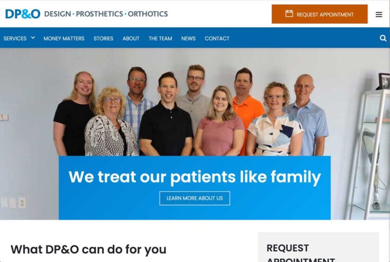
Colour Contrast
While the existing brand palette looked accessible, minor adjustments had to be made in the new brand palette to achieve the contrast ratios specified by WCAG standards.
Text Legibility
The re-designed website also avoided using images as a background for text, as this could pose challenges for visually impaired individuals.
The breadcrumbs component, as well the home page hero section where two areas where the old design risked creating legibility issues for visually impaird users,


DP&O – Text Legibility

The breadcrumb component on the new website was placed on it’s own background to ensure legibility.

Test on the home page hero section over-lapped the image natively impact both the content legibility and the image being used.

The text in the hero section of the new website had it’s own section.

The breadcrumbs on the old Drupal website were displayed above an image which can be difficult for some users to read.
Building for Users of Assistive Technologies


DP&O – Keyboard navigation


Keyboard navigation
The website was build to be fully operable via keyboard. This was achieved by:
- Ensuring all interactive content could be navigated using the tab, enter, and esc keys
- Ensuring a logical Focus order [2.4.3] as content is revealed and hidden, based on the users’ behaviour, by modifying the tab-index attribute using jQuery.
- Providing a clear discernible focus styling for user navigating with a keyboard [2.4.7].
- Provided a way for keyboard users to bypass repeating content blocks such as the global navigation [2.4.1]
Screen-Readers
All keyboard accessibility measures apply to screen-readers as well, because they also require the keyboard to operate the website.
Additionally HTML markup also requires appropriately used ARIA labels to help screen-readers identify interactive elements and their states. All WCAG 2.1 AA success criteria was thoroughly reviewed and appropriate ARIA attributes were assigned to the relevant website components based on the recommendations.
Due to budget restrictions we mostly relied on test results from a variety of automated accessibility checkers to identify any issues the could have a negative impact screen-reader usability.

DP&O – Screen-Readers
This is how the WAVE checker highlighted all of the ARIA features on the DP&O homepage
WCAG Compliance Automated Testing Results

DP&O – WAVE by webAIM – Final results
WAVE by webAIM
The final build boasted 0 errors flagged using the WAVE checker. However, there was one alert flagged, “Possible Heading”. WAVE alerts are items which may require attention but are not necessarily an accessibility issue. In this case this is simply flagging any bolded navigation menu item, which is bolded to indicate that this is the current active menu item [2.4.8].
AccessScan by Accessibe
The standards of the ADA (Americans with Disabilities Act) align well with WCAG standards, making AccessScan a reliable testing platform.
The the production build of DP&O website tests as ADA-compliant, however AccessScan does flag a few areas for possible improvement.

DP&O – AccessScan by Accessibe Final Results

DP&O – Chrome Lighthouse Final Results
Chrome Lighthouse
The DP&O website gets a perfect accessibility score when tested by Chrome’s Lighthouse inspector tool. Even with a perfect score Lighthouse provides a list of items to check manually.
Insights & Take-aways
My Ever-Growing Appreciation of a Holistic Approach to Testing
Automated testing allowed me to do identify the bulk of accessibility conflicts efficiently, and the final product did well in every automated test result, but true accessibility goes beyond automated testing, and ensuring guideline compliance should always include a human element.
The site was built to be operable for users of assistive technologies and throughly tested for keyboard accessibility. Unfortunately the budget didn’t allow for a in-depth screen-reader test round.
Manual keyboard testing, however, provided valuable insights into the challenges of navigating a website using a keyboard – which allowed me better empathize with users who rely on solely keyboards to operate websites.
Looking Ahead
Built-In Accessibility Tools for CMS Platforms
At the time of building this website, WordPress had many features to facilitate the creation of accessible content.
Unfortunately some features, like the contrast checker, were tricky to implement in custom components, and did not give accurate assessments in edge-case scenarios.
However, this still demonstrates an overall trend towards empowering CMS users to generate accessible content. A great article on re-imagining SquareSpace for accessibility does an excellent exploration of data-driven accessibility solutions for the popular website-building & CMS platform.