Case Study
Streamlining
front-end workflow

Case Study
Streamlining front-end workflow
A browser-based component library and front-end framework, built with Bootstrap, for the Sheridan Design System.
Background
A front-end foundation for every platform
Sheridan operated multiple digital properties – a primary website in Sitecore, internal ServiceNow portals, and department-owned sites – which all needed to align to the same brand and front-end standards. A Drupal migration was also being dicussed for the primary site.
I built the browser-based SDS Manual to serve all of them. It documented components, markup, and front-end framework assets in one place – reducing design decisions across platforms, compressing implementation costs, and giving vendors direct access without a Figma dependency.
Process
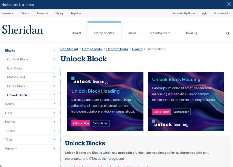
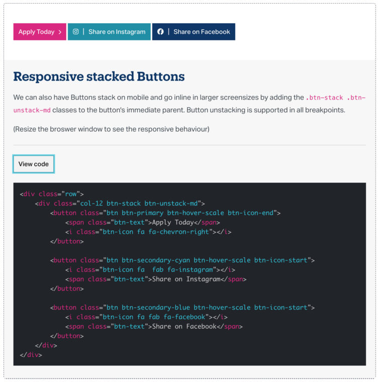
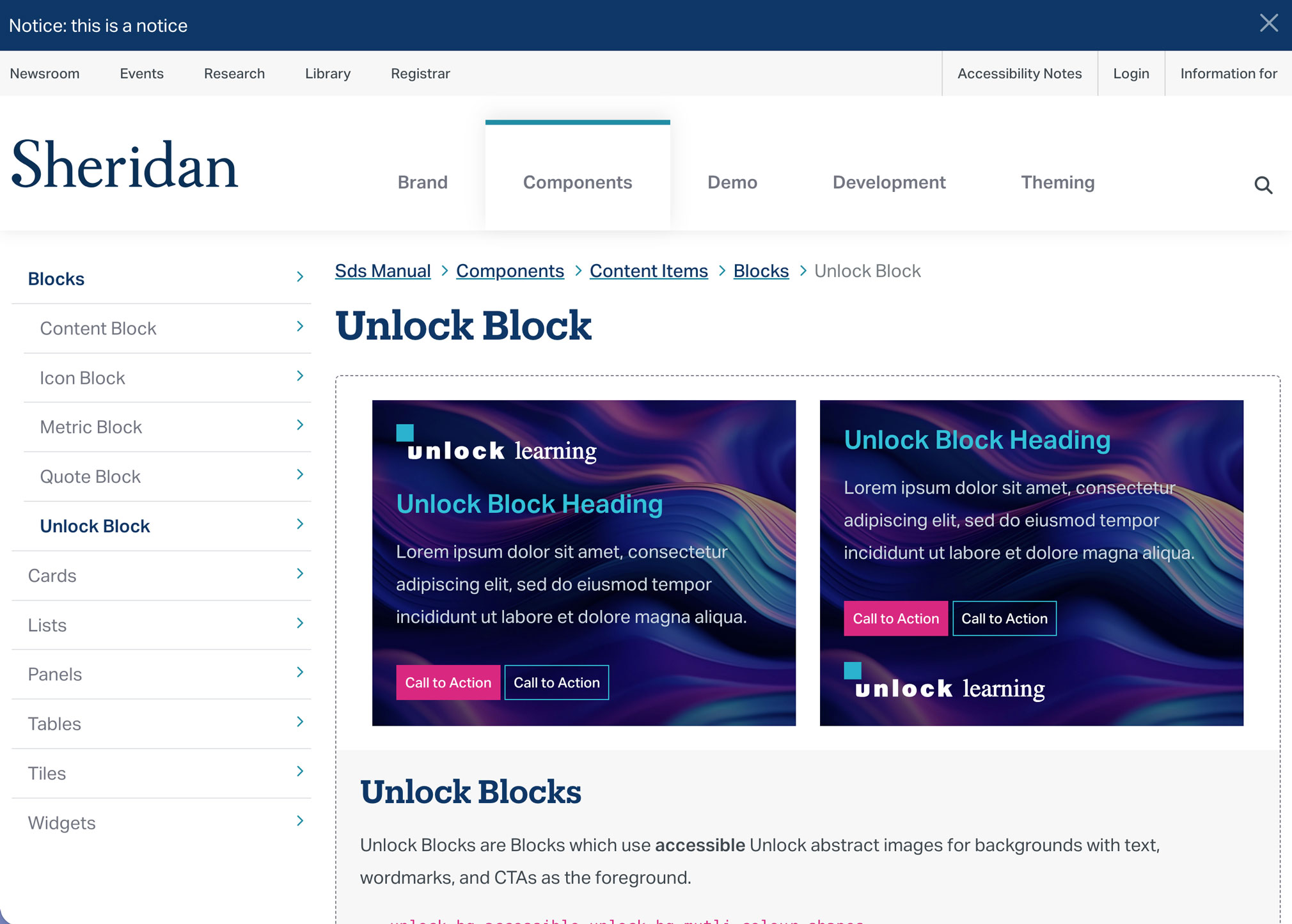
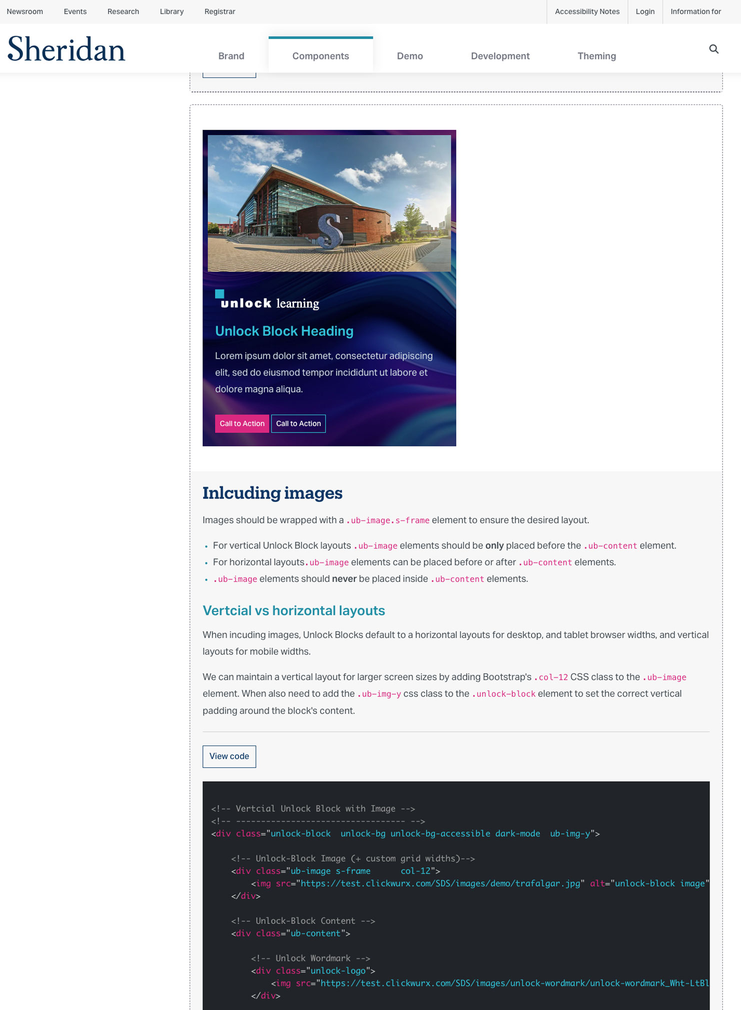
Documentation page for the Unlock Block component
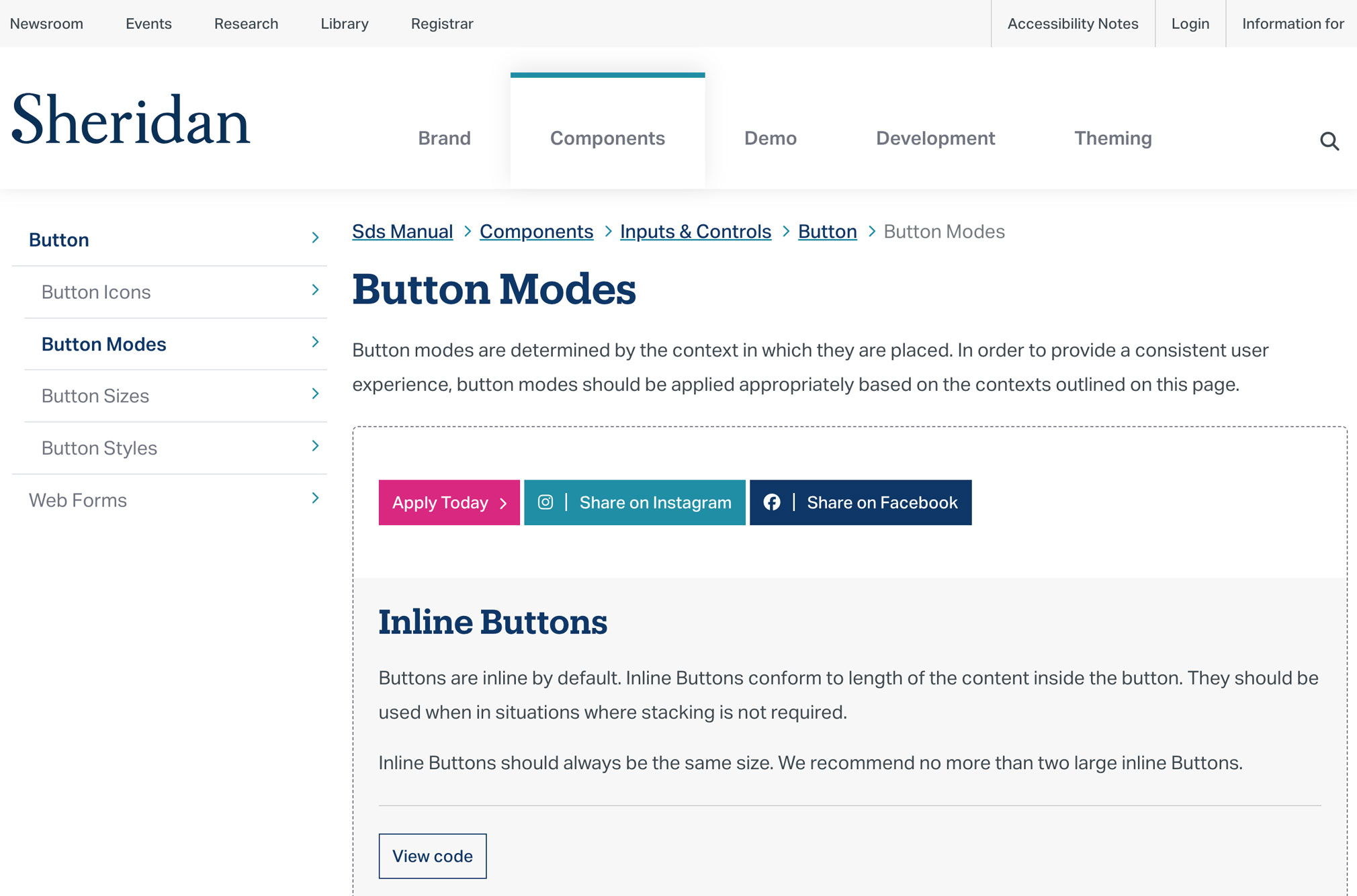
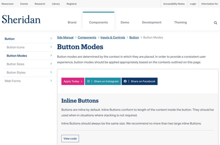
Documentation page for button modes
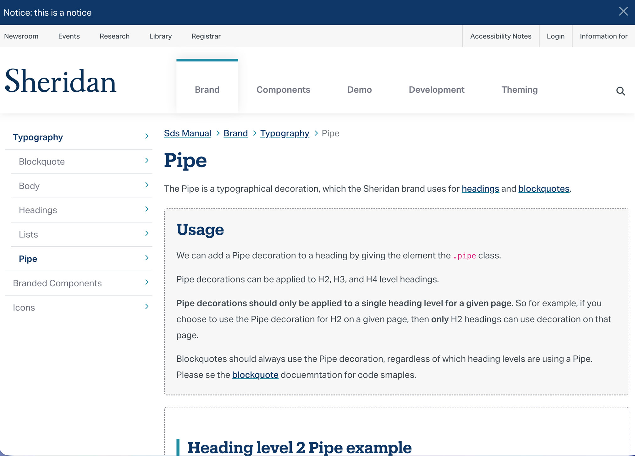
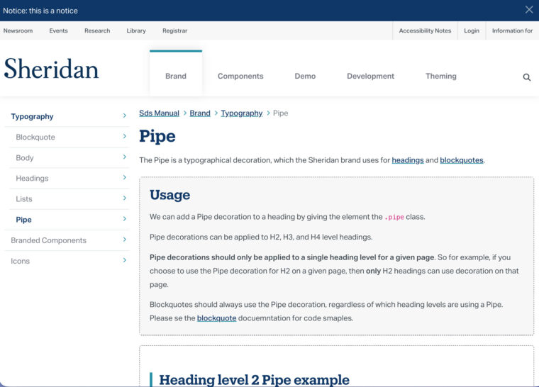
The “Pipe” typography decoration documentation page
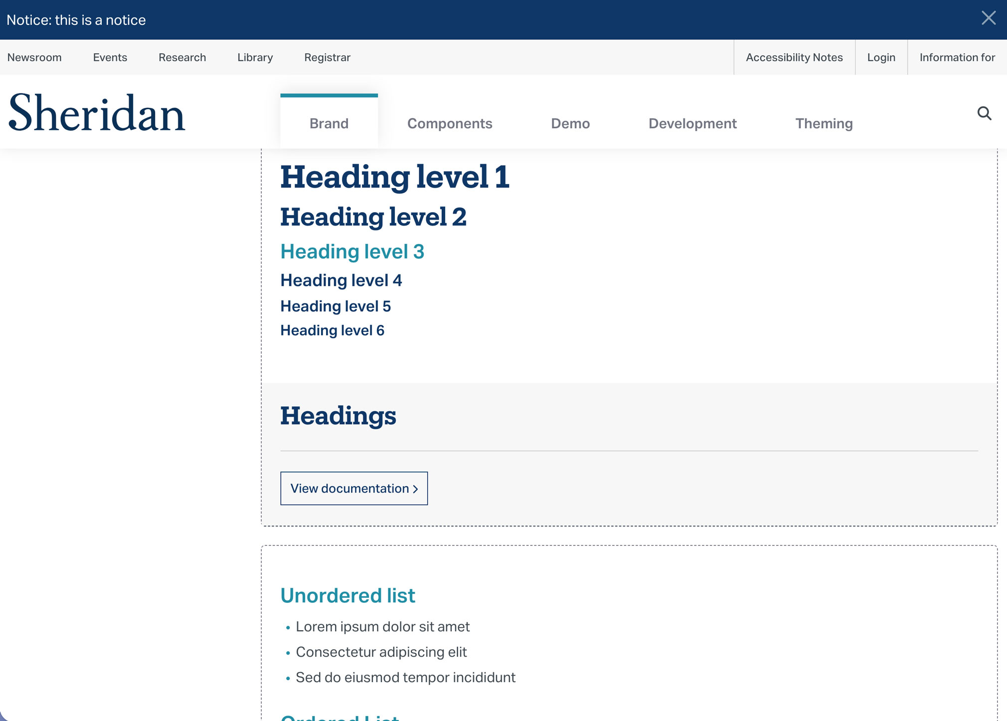
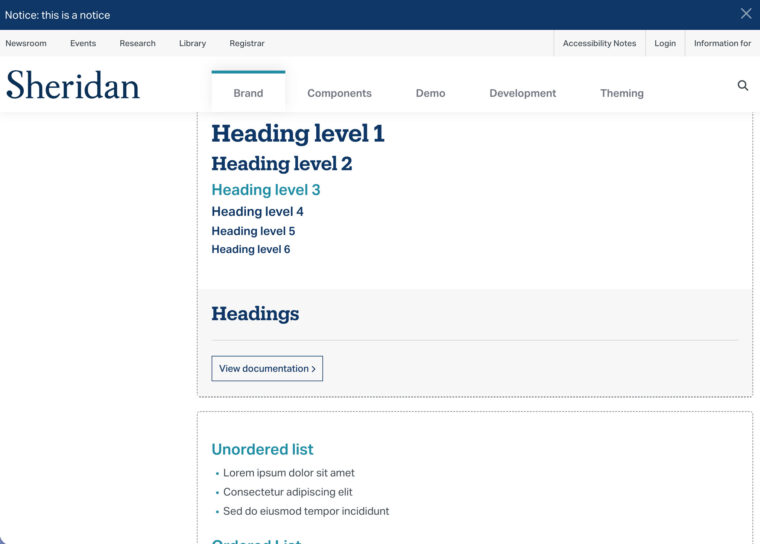
A section of the typography overview page
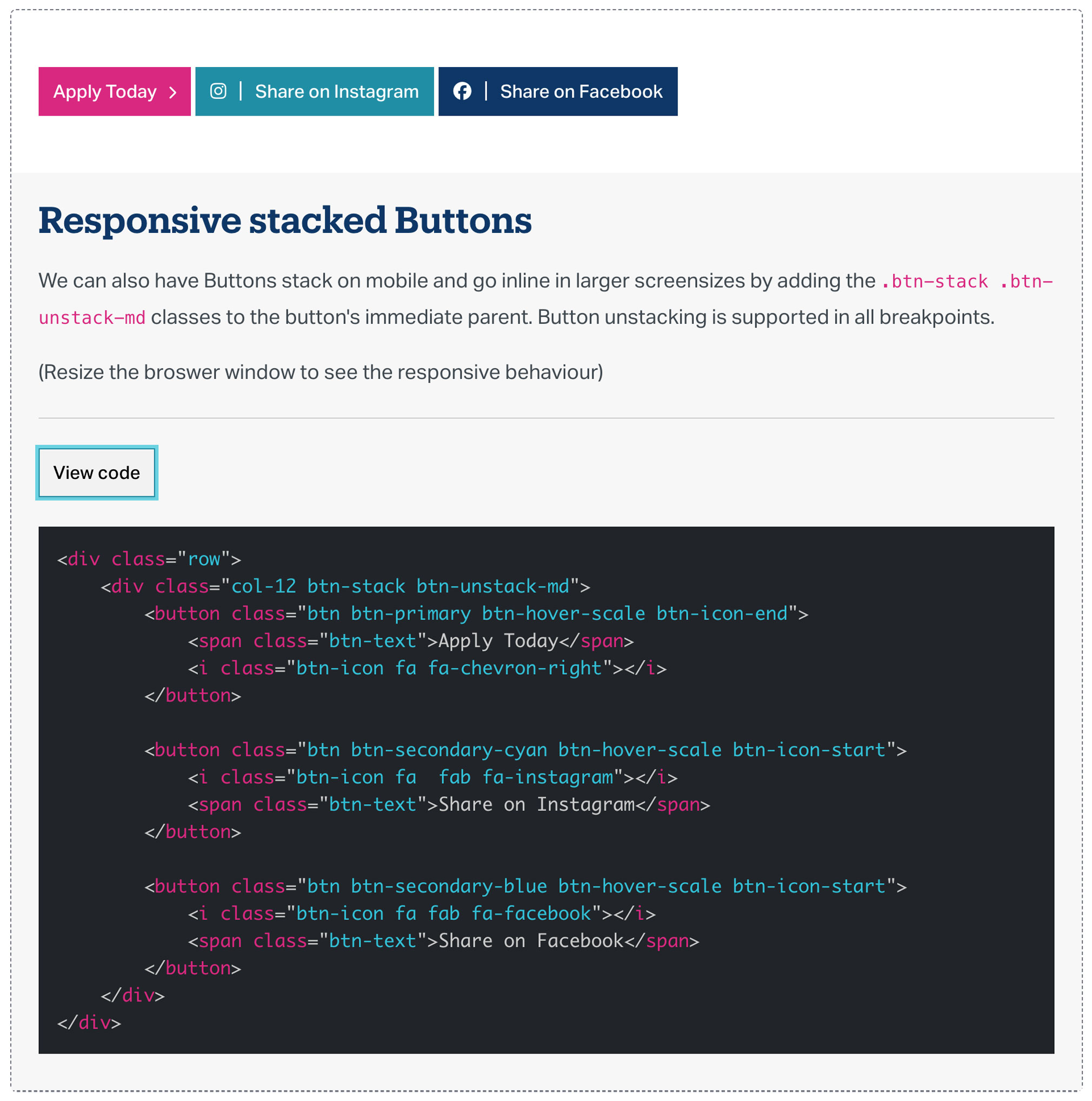
Sample code for responsive button stacks
A browser-based component library
The component library started in Figma, but a browser-based version could do more – interactive demos, live markup, and framework assets all in one place, shareable with anyone on the team without a Figma dependency.
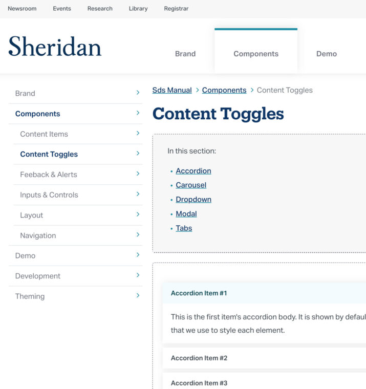
The SDS manual documented everything from UI components and typography to decorative elements and accessible specs – each with its own dedicated page or section.
Developer-friendly features
The goal was for the SDS Manual to be genuinely useful to developers – not just documentation they’d reference once and then ignore.
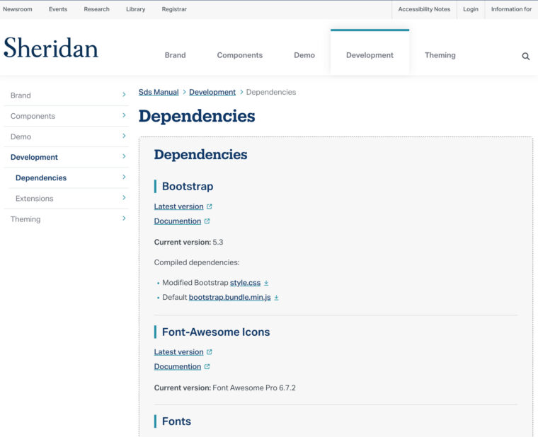
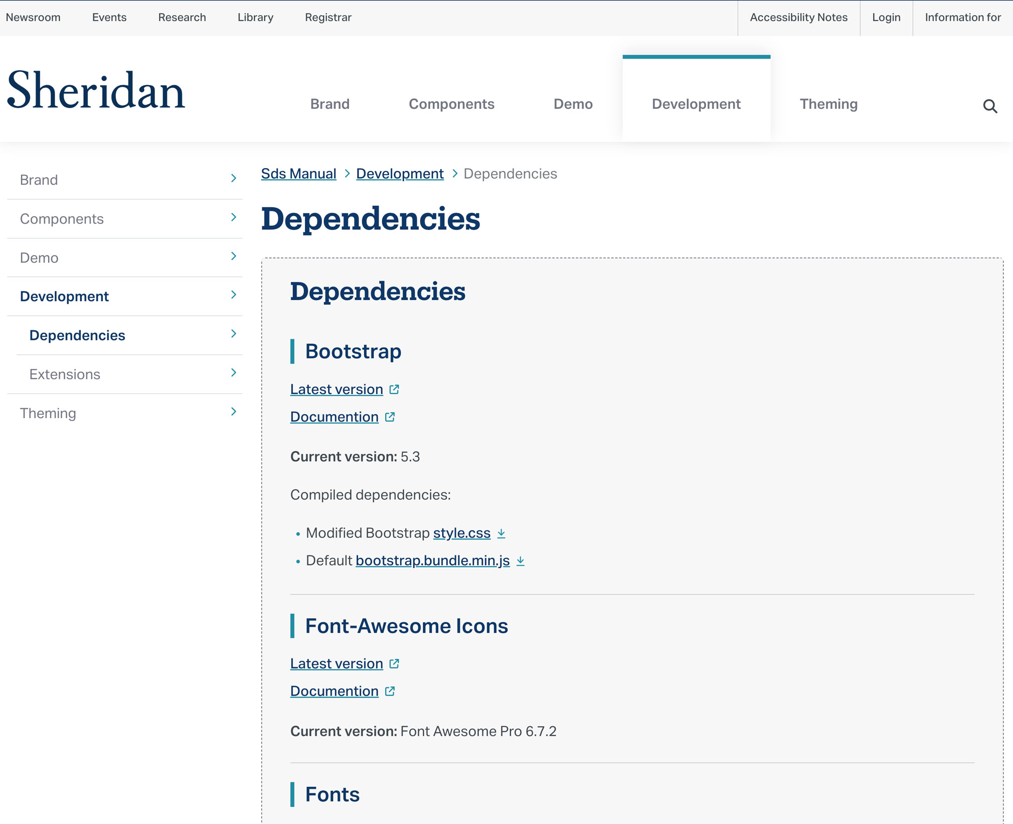
Every component page included markup code snippets, ready to use with the Bootstrap-based framework.
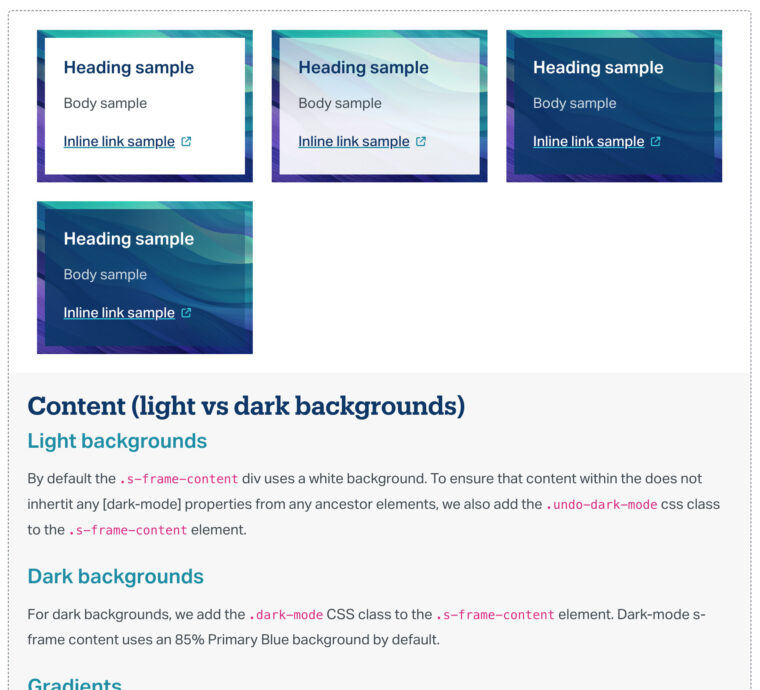
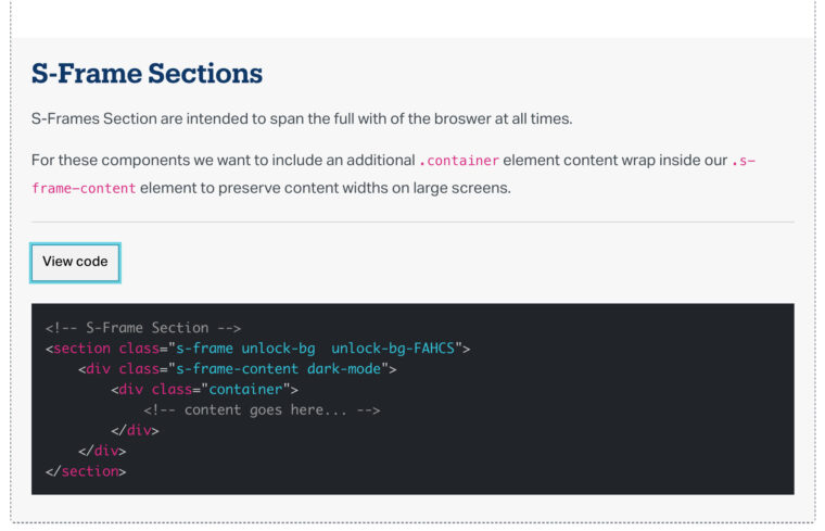
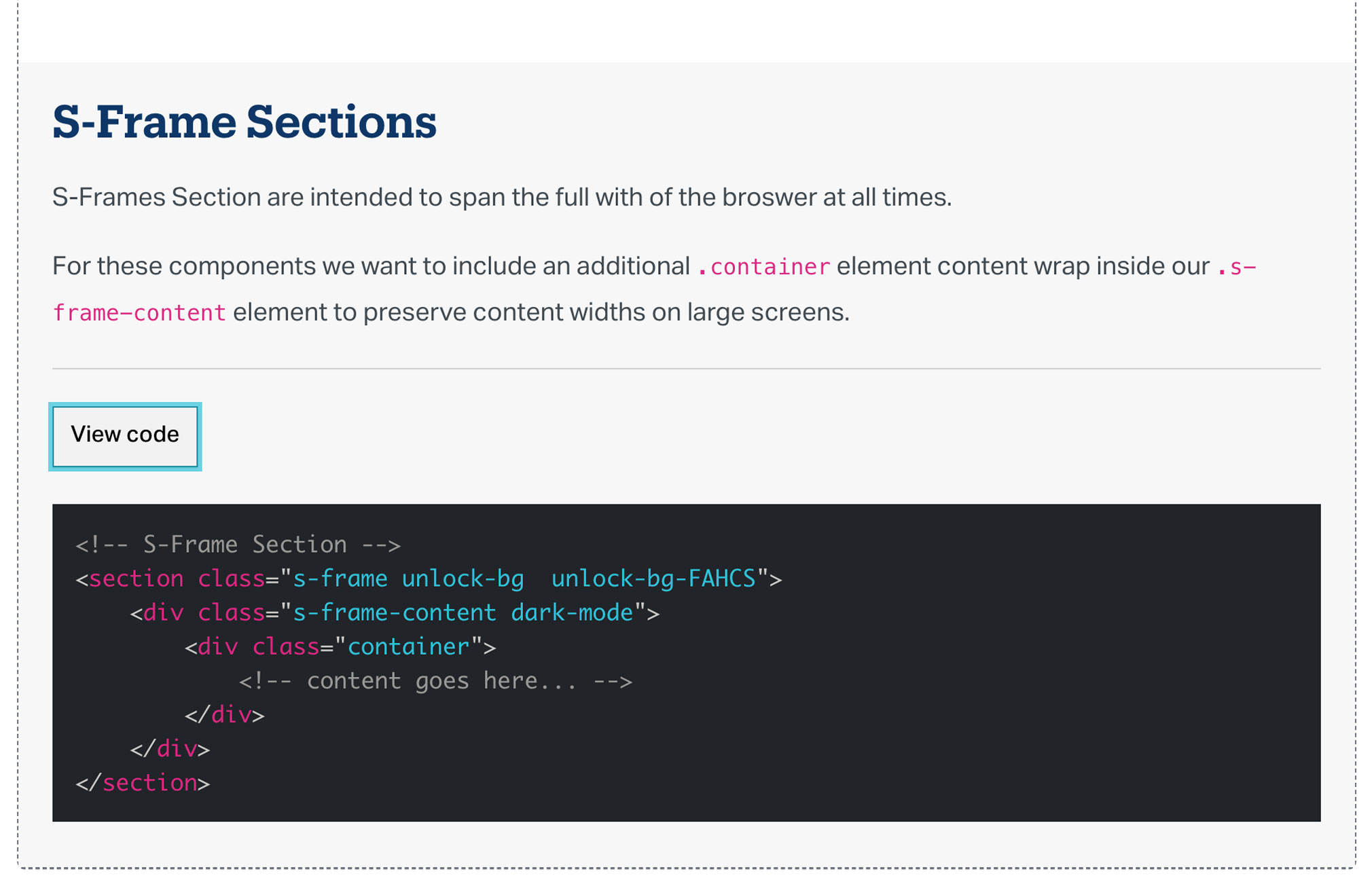
Custom solutions like the S-Frame had tehir own implementation guide, complete with CSS class references. All framework assets were downloadable directly from the manual.
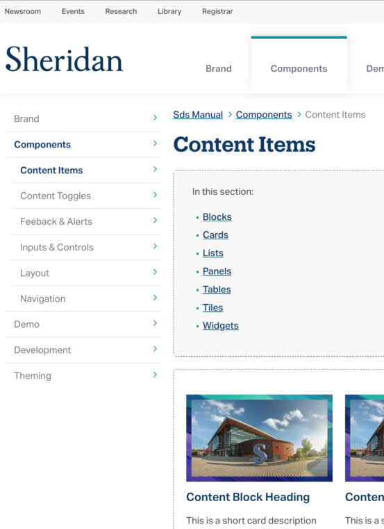
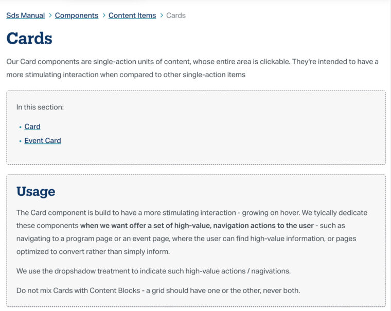
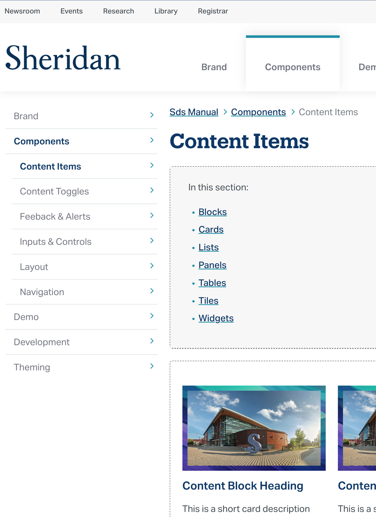
Content Items: Blocks, Cards, Lists, Panels, Tables, Tiles, and Widgets
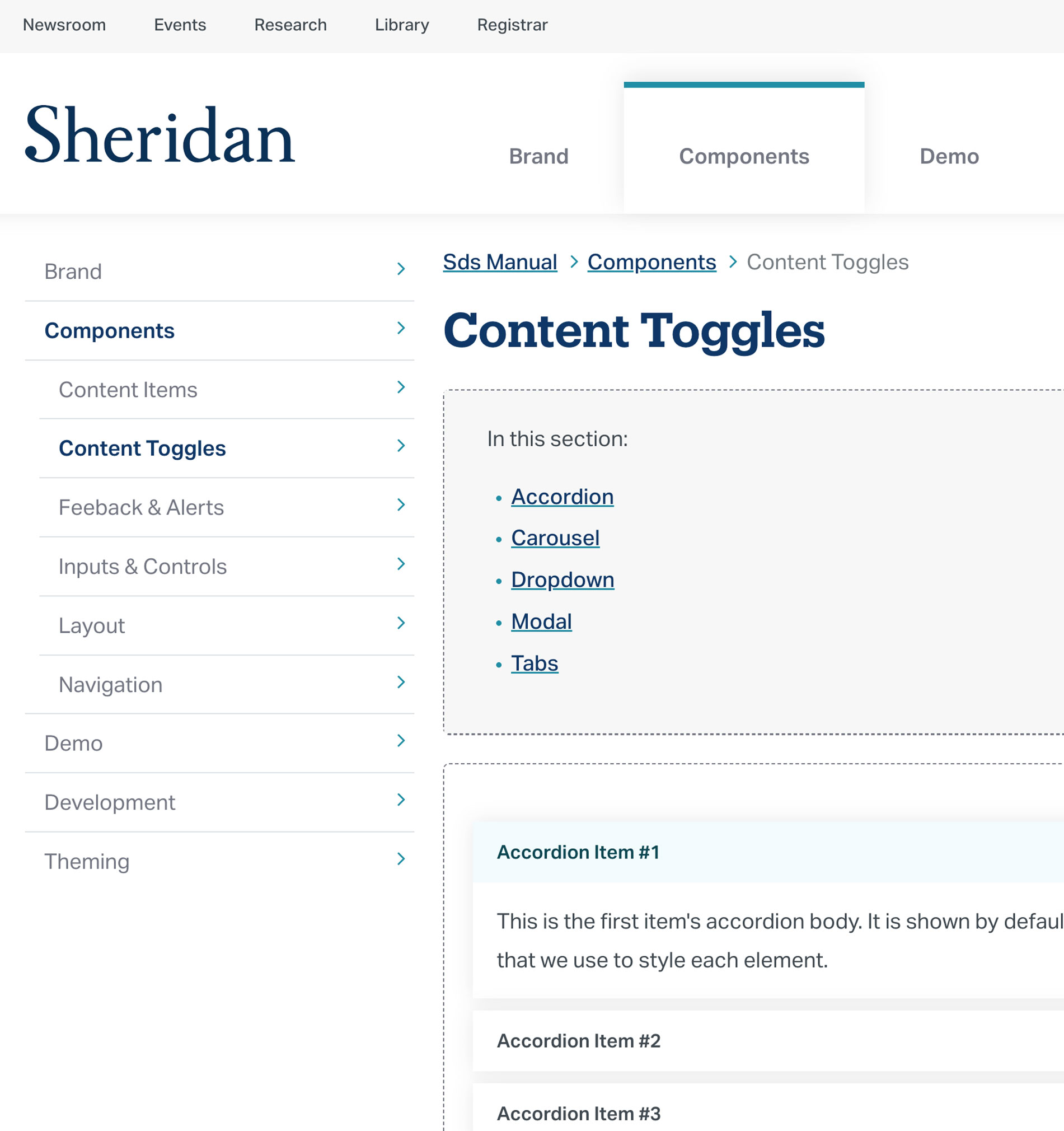
Content Toggles: Accordion, Carousel, Dropdown, Modal, Tabs
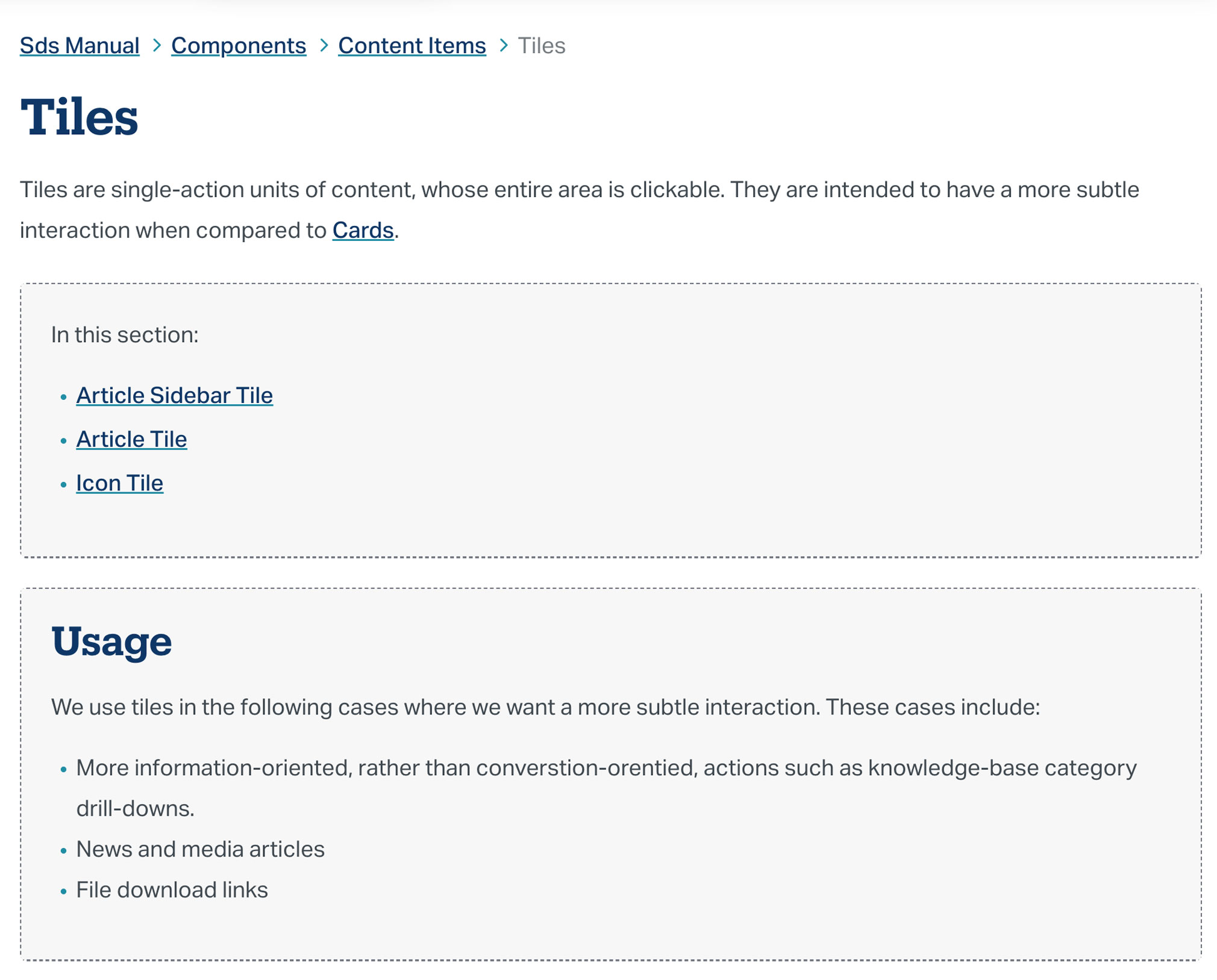
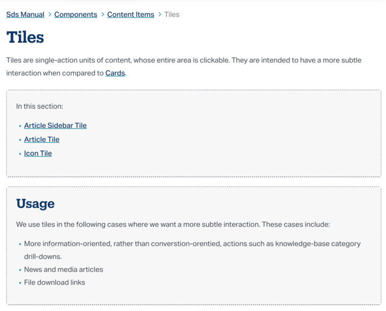
Tile variants and high-level usage rules
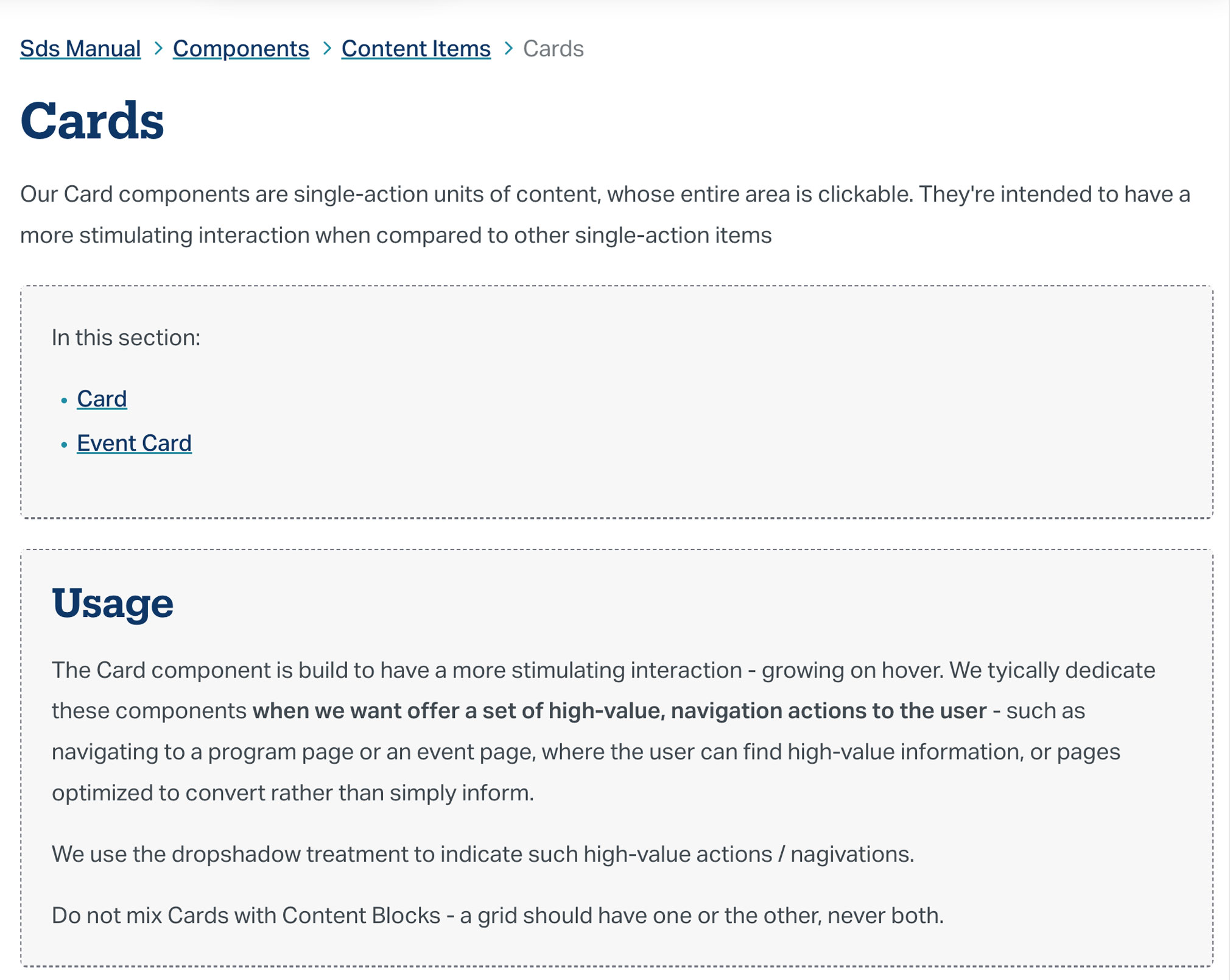
Card variants and high-level usage rules
Meaningful component names
Component naming was inconsistent – CSS class names, component labels, and grid-level terms like cards, tiles, and blocks overlapped in ways that made it unclear how each pattern should behave, or when to use one over another.
I resolved the naming across the system – each component got a distinct name and explicit usage rules. The goal was a shared language that reduced ambiguity for developers and content managers, and helped the UI communicate functionality more consistently as the system scaled.
Consistent dark mode styles
Sheridan’s site had already been using light text on dark backgrounds, but the implementation was ad hoc – layers of band-aid styles without a consistent system behind them.
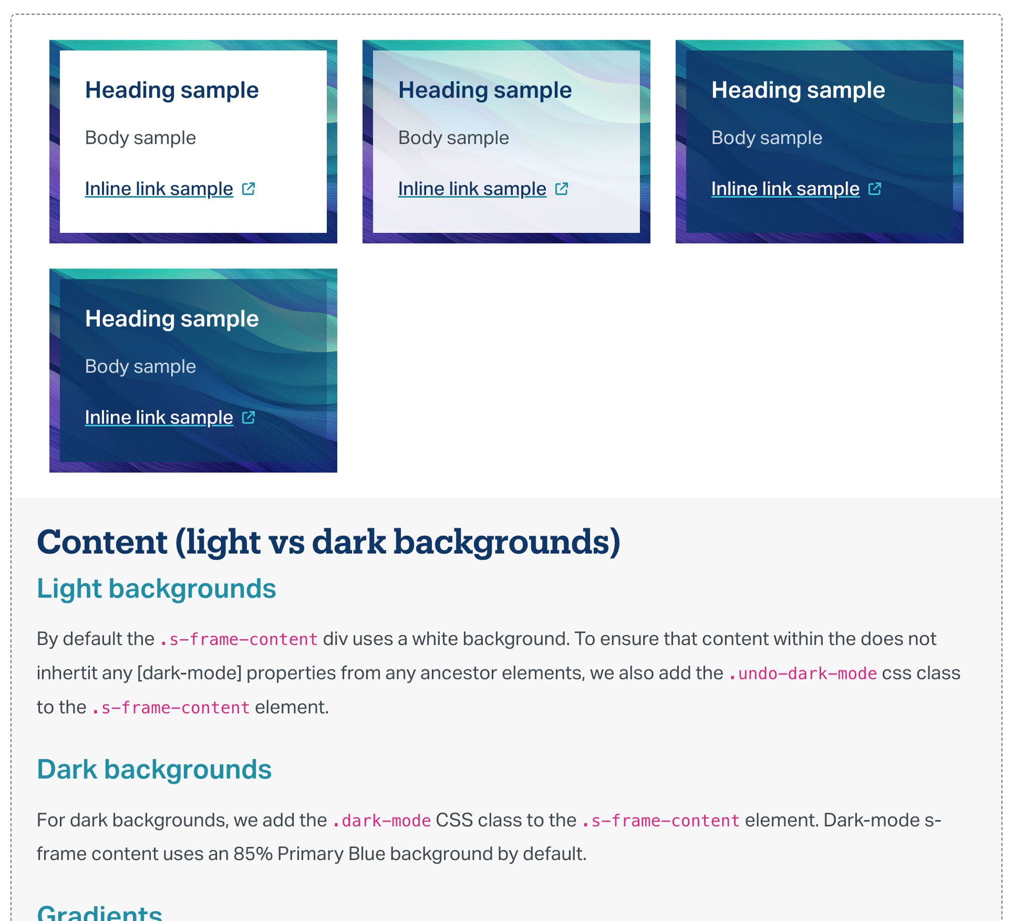
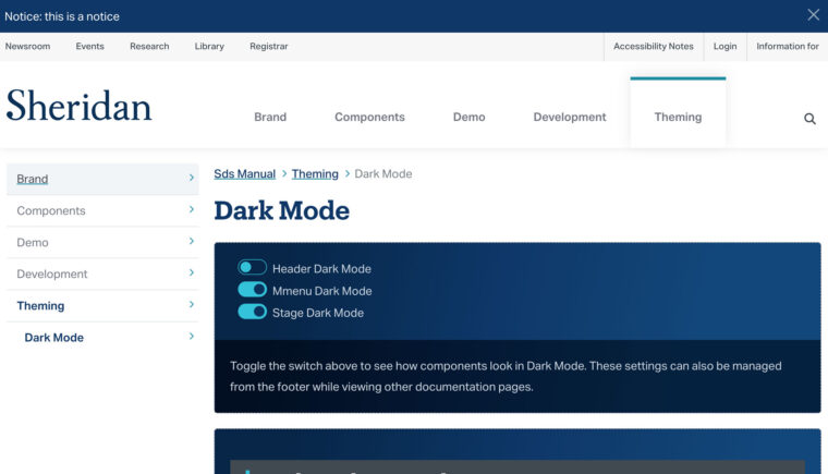
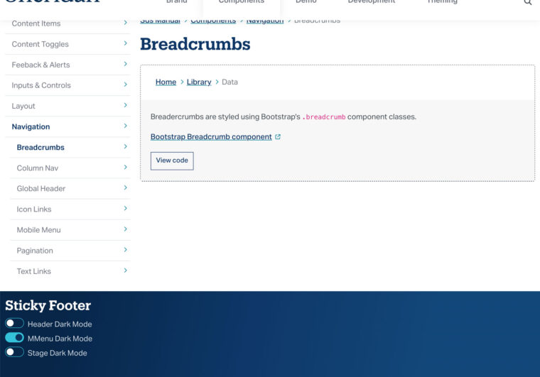
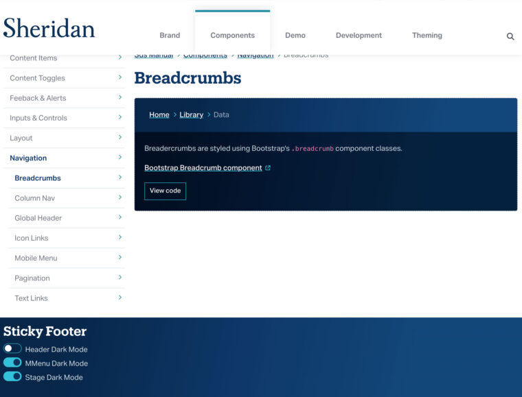
I standardized the styles into a proper dark UI theme, which could be toggled from the footer of the dedicated Dark-Mode page in the SDS Manual. The goal was richer component demos and to support future accessibility testing with real users.
Bootstrap’s built-in theme switching handled most of the heavy listing, but content builders like ServiceNow and Drupal needed a simpler implementation. I added a .dark-mode class to make the theme easy to apply outside of the core framework.
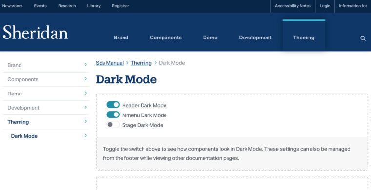
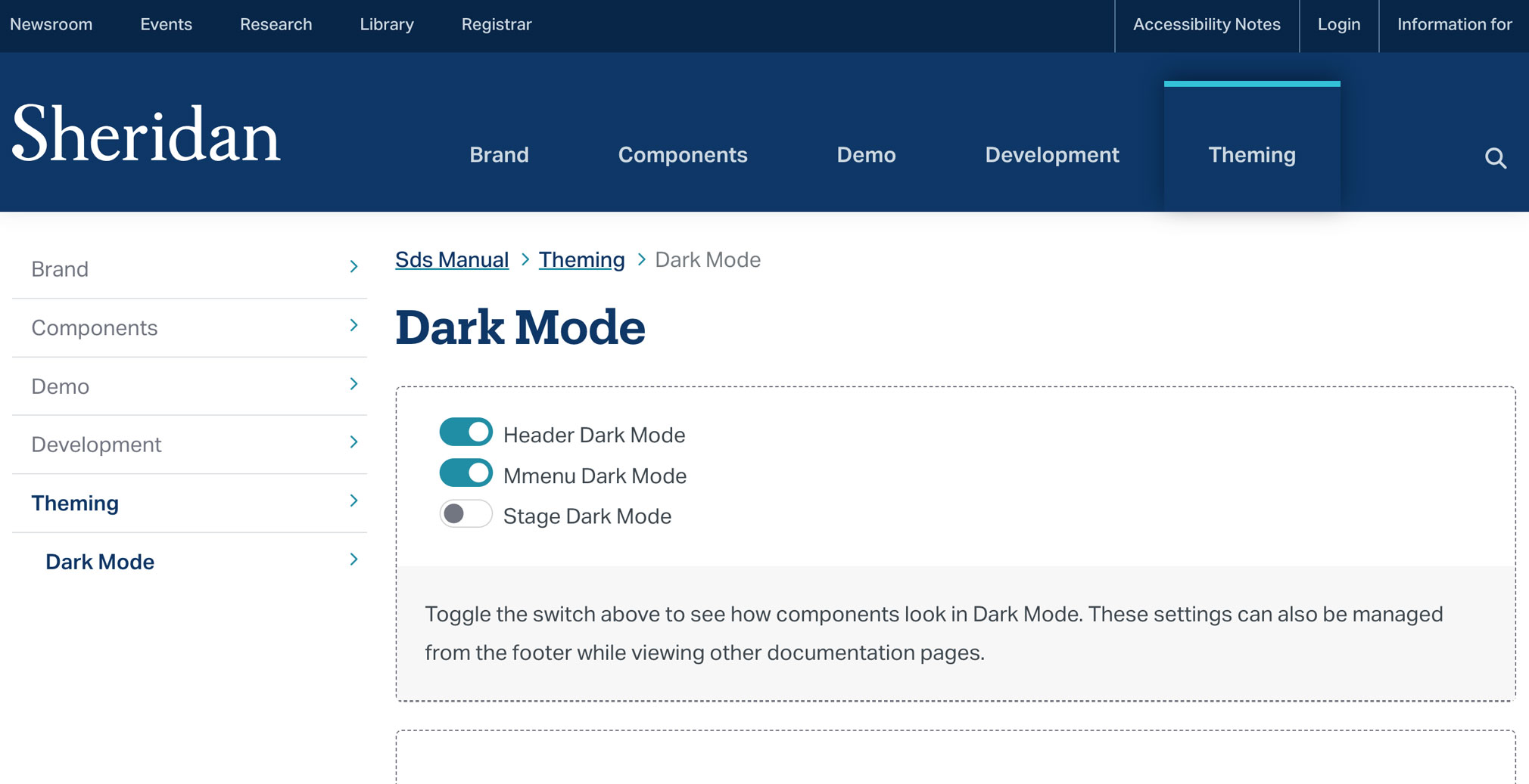
Theming toggles in the dark-mode documentation page. Global header set to dark-mode.
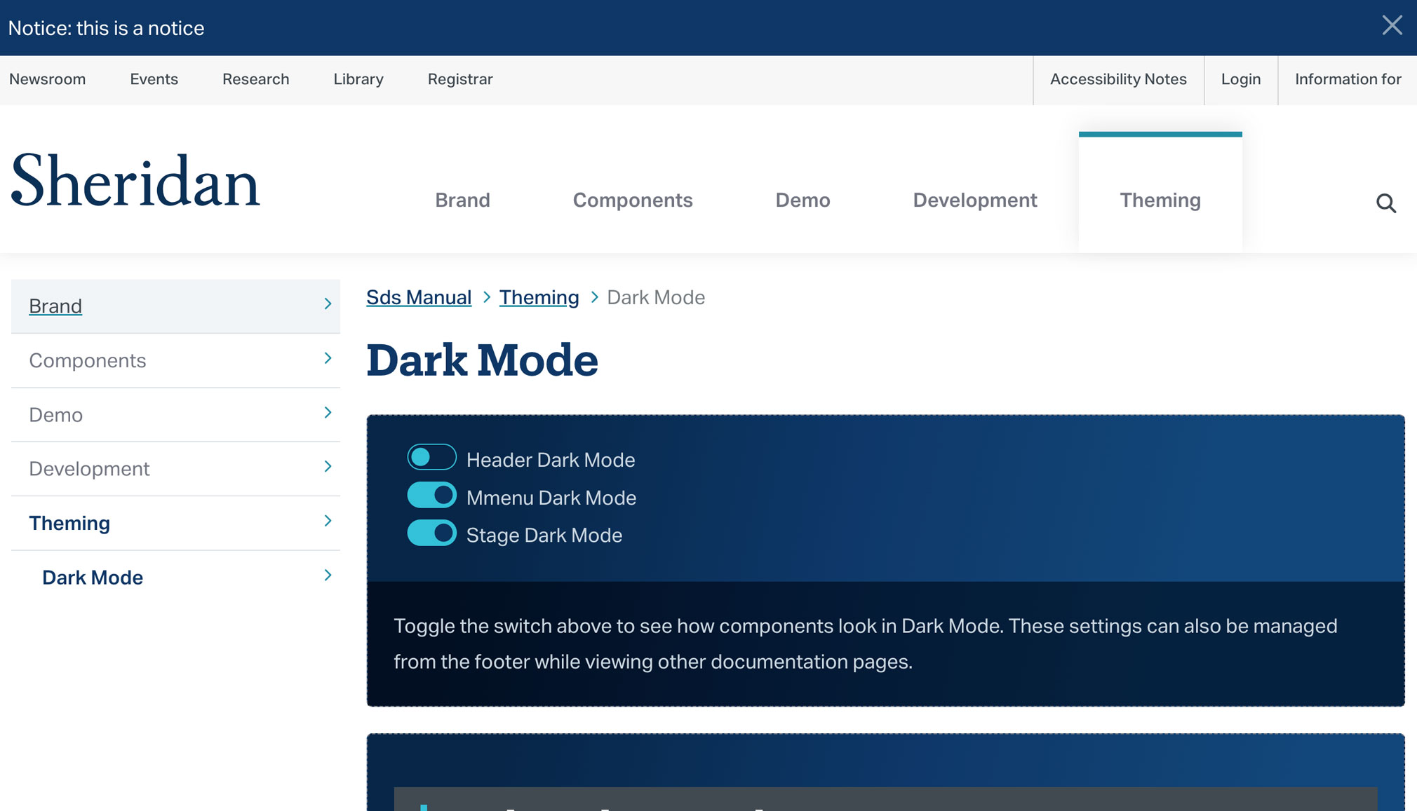
Dark-mode page: component stage set to dark-mode.
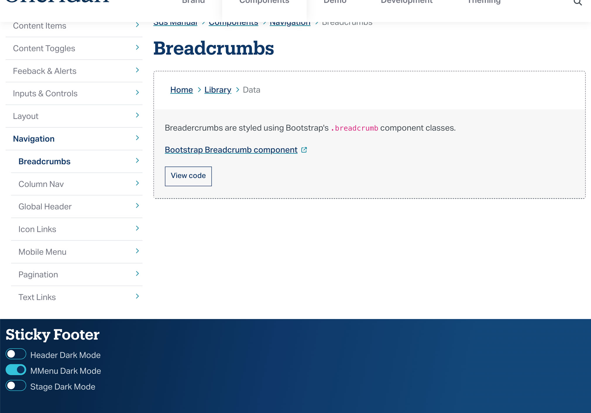
Breadcrumbs component page. Also included in the screenshot are the dark-mode toggles in the footer, which are accissible from any SDS Manual page.
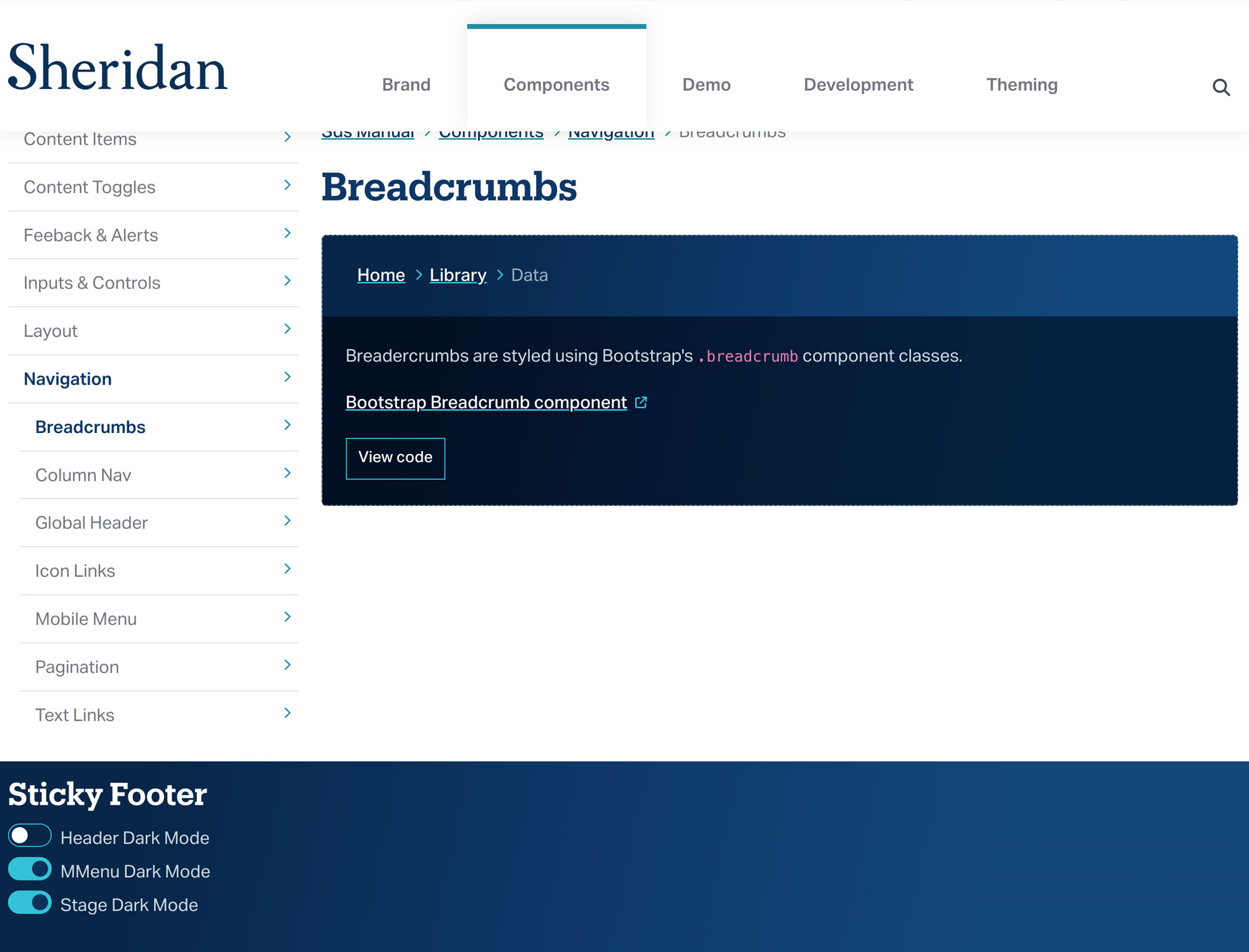
Breadcrumbs component page with stage set to dark-mode.
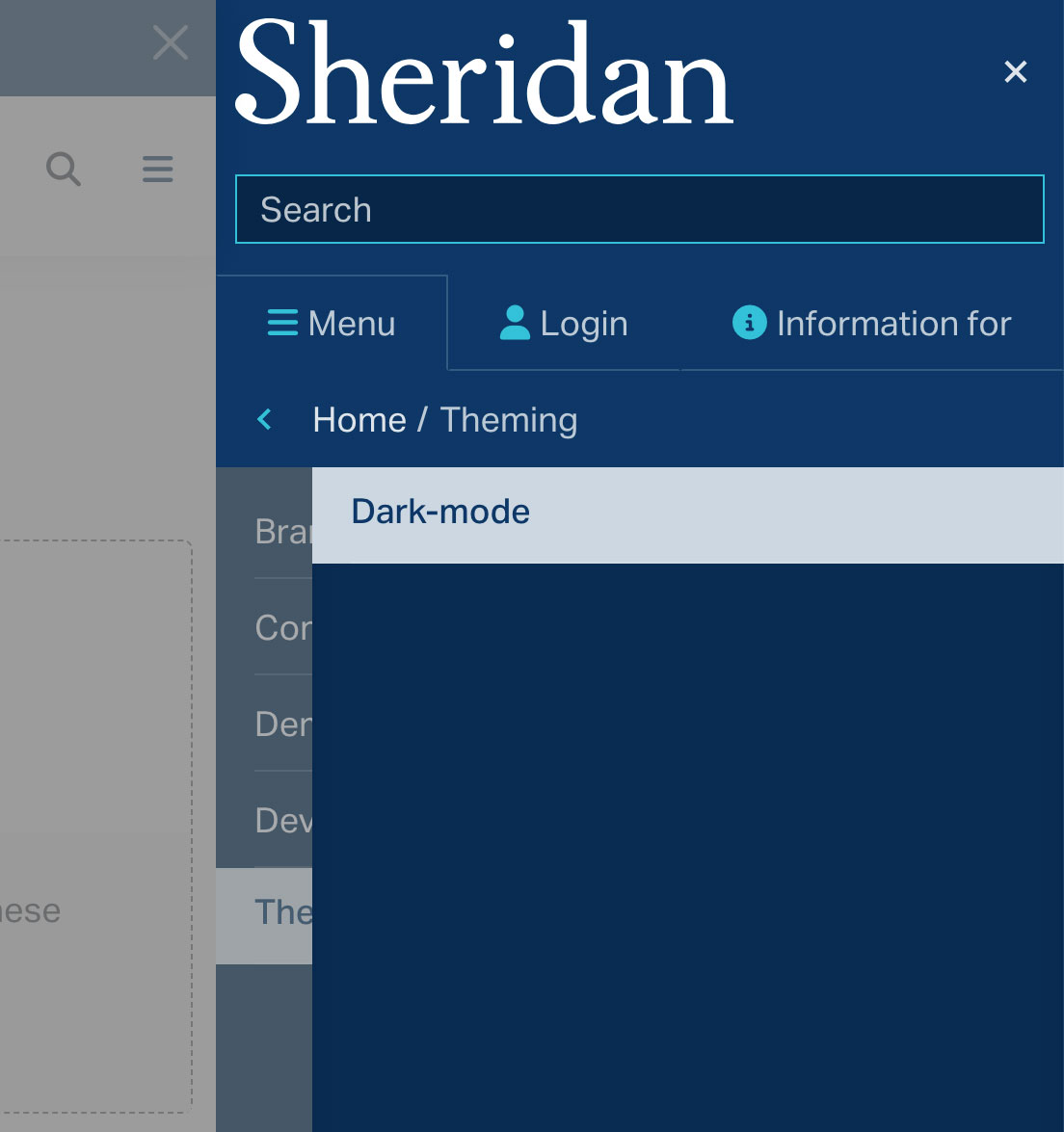
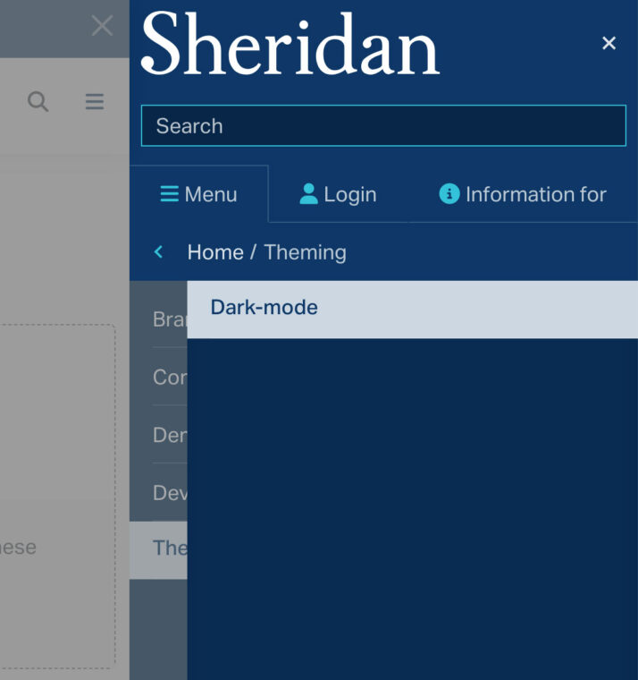
Mobile menu in dark-mode.
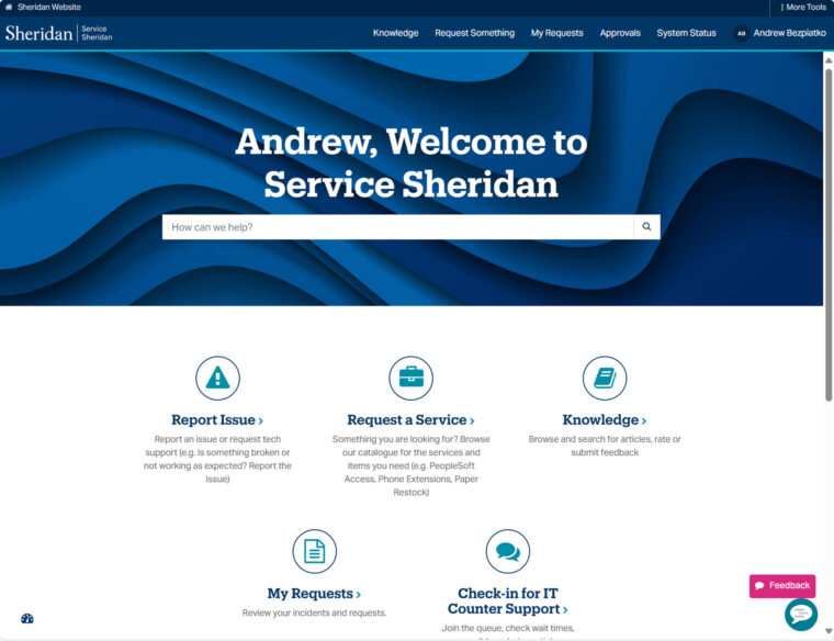
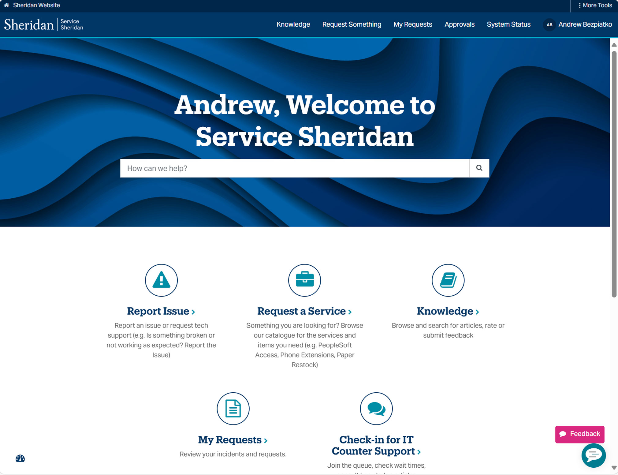
Sheridan’s service portal request page (after SDS implementation)
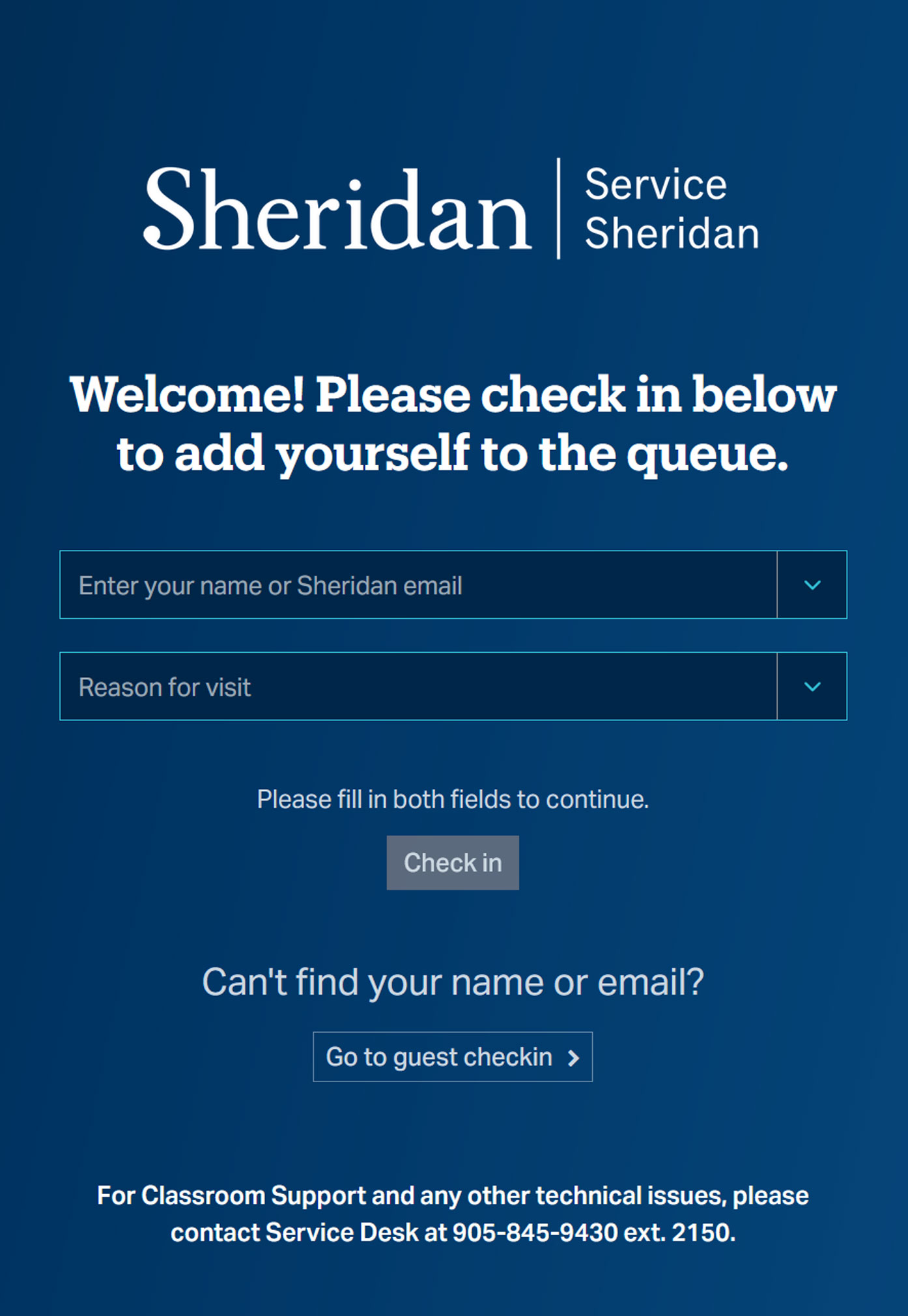
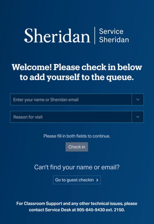
Sheridan’s service kiosk login screen (after SDS implementation)
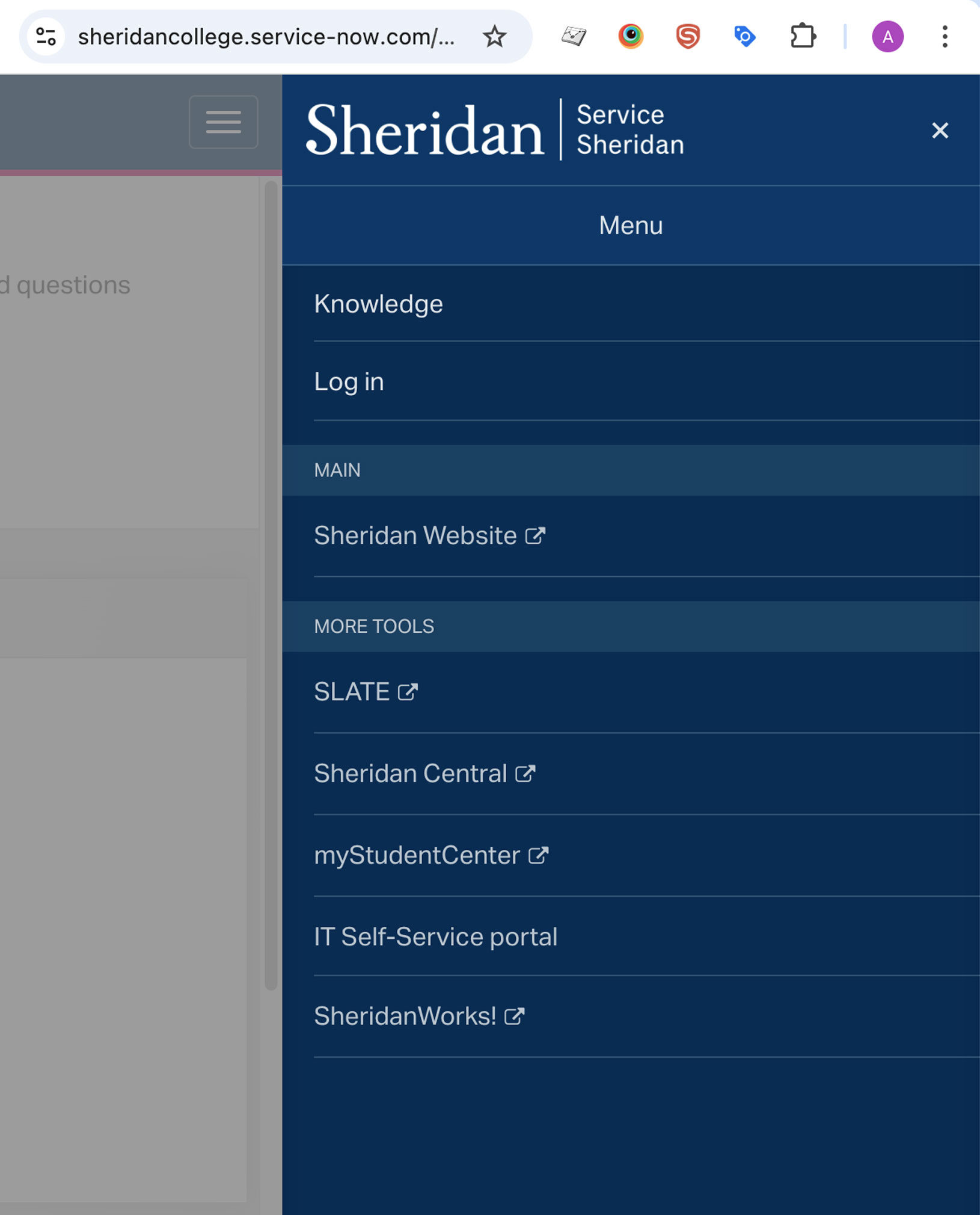
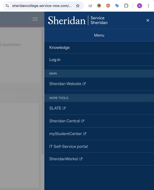
I successfully integrated the SDS mobile menu (MMenuJS) into the ServiceNow theme
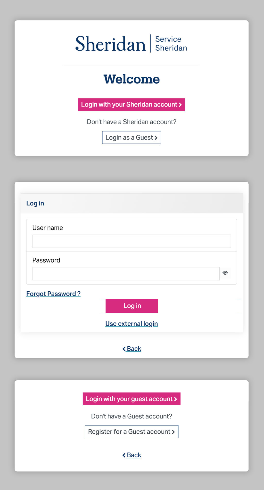
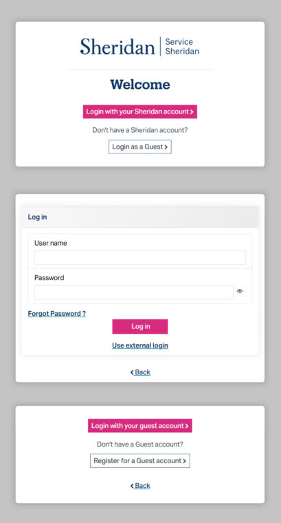
Modal instances from the improved login flow
From documentation to deployment
The SDS manual’s first real test was Sheridan’s ServiceNow portals. Rather than starting from scratch, I was able to scale the front-end foundation directly into the new platform – porting styles into a ServiceNow-specific SCSS file and implementing MMenuJS to deliver a richer navigation experience that Sitecore constraints had prevented on the main site.
The result was brand and UX alignment across tow platforms, delivery internally without vendor involvement.
Insights & takeaways
Advocacy, adoption, and vendor drift
Having worked on the agency side, I understood why a vendor would push their own direction – it’s how agencies demonstrate value. WHat I didn’t have early enough was the business language to make the cost of that draft clear to leadership.
During Sheridan’s Drupal migration, I identified misalignment early and worked through multiple channels to keep leadership and the vendor aligned – but without clear governance and regular touchpoints, the implementation was hard to keep anchored to the system.
The lesson: communicate value in business terms early, establish clear ownership, and don’t let alignment depend on goodwill.

