Case Study
DealTap

Case Study
DealTap
Improving digital real-estate transactions and
helping align the product team.
Background
What is DealTap?
DealTap was a bespoke real estate transaction platform. Conceived of just as eSignature tools were emerging, the goal of the product was to streamline the Real-Estate transaction process and bring it into the digital age.
My Role
DealTap had a strong design foundation – the CEO and PM were both design grads who led the UX process, facilitated workshops, and set product direction. I came into the role with an established track record at the company and contributed across domain mapping, UI design, research and front-end implementation.
Highlights

DealTap – Mapping the Work-Flow
This document flow diagram referenced when generating additional UX Artifacts, such as user journeys
Mapping the Work-Flow
Ontario real estate transactions are complex – multiple forms, multiple parties, and multiple signatures at every stage of a negotiation. With out a clear picture or how everything connected, the product team risked designing workflows that didn’t reflect how real estate transactions actually worked.
I mapped the full transaction workflow independently – documenting the relationships between every form involved in an Ontario real estate deal. The diagram became a shared reference across design and development.
Guerrilla research at realtor conventions
At a realtor convention, the team set up a demo booth to showcase the platform to real estate professionals. What started as a demo become an informal research opportunity as the team observed real users attempting live tasks on the platform.
The friction was visible. Users paused, hesitated, and frequently needed guidance to complete form-heavy workflows. The signal was clear that the UI wasn’t communicating itself. Needing to show someone how to use a product during a demo is its own form of usability finding.
The observations contributed to a broader set of UI improvements across the platfrom.



DealTap – Guerrilla research at realtor conventions

We prepared a few simple task for user to accomplish with using DealTap, observed their and took notes any friction point we observed. We also to the time to ask a few brief interview questions to better understand our users needs.




DealTap – Re-Working the ‘People’ Section

This was the version of the problematic “people” section, which needed improvement. Notice the single column layout, and labelling used to describe the participating parties.
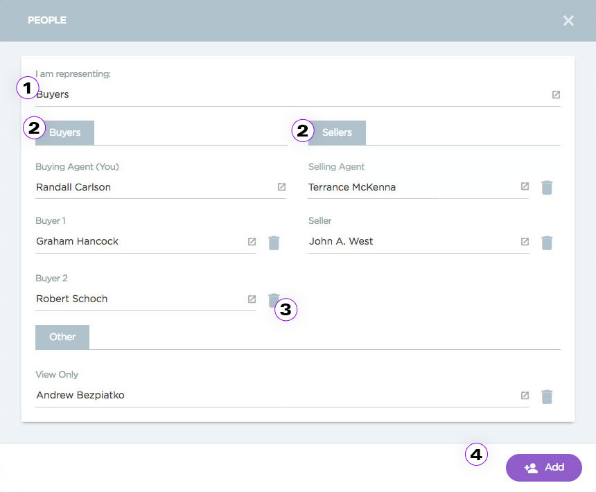
1. Initial nomenclature centred around ‘Offering’ and ‘Receiving’ parties. We changed this to ‘Buyers’ and ‘Sellers’ as this initial terms were confusing. 2. A two-column layout allowed us to fit more information on the screen. 3. Quick delete button 4. Removed the cancel button because it was redundant.

2. We also flagged columns when they were empty

This is the mobile version the revised “People” section
Re-Working the ‘People’ Section
The people section was one of the primary sources of friction observed at the convention. It was reworked to address several usability issues:
- Simpler language – Offering and Receiving are legal terms, and they required more recall effort than Buyer and Seller.
- A two-column layout – fit more information on screen and prompted users when columns were empty.
- A quick delete button – previously, deleting a party required navigating through the edit section.
- Removed the cancel button – it was redundant.
Designing the Input Field Editor
DealTaps forms were built into the platform, but PDF documents couldn’t be ignored – scanned forms were widely used in real estate transactions and had to be supported.
Convention research supported this. The need to reposition input fields on scanned documents was clear. I was tasked with designing a robust UI element simple enough to use on a touchscreen as small as an iPhone5.
The new component allowed users to:
- Add text, initial, and signature inputs
- Support multiple users within a single input field
- Control field position a size
- Edit, delete, duplicate, and undo field actions


DealTap – Designing the Input Field Editor

Empty, filled and active signature input field examples

The dynamic-doc input field editor

Empty, filled and active textbox input field examples
Reflections
Measuring Success
The product shipped before we had an opportunity to validate our improvements against baseline research data. In hindsight, the right measures would have been:
- Transaction abandoment
- Deal generation speed
- User-reported frustration
These metrics would have directly design decision to business outcomes.

